Controls
Slideshow
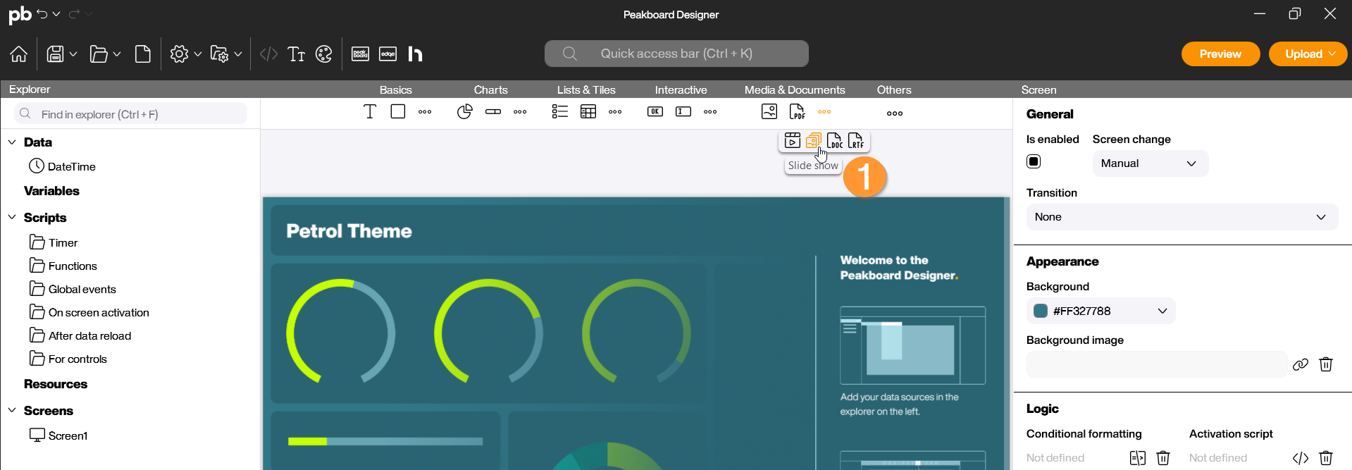
The Slideshow control is specialized in displaying a sequence of images in your visualization. Unlike the simple Image control, which displays only a single file, the Slideshow can process dynamic image lists and play them automatically. This is ideal for displaying product images or brand logos. You can find the Slideshow in the Peakboard Designer within the Media & Documents group (1). Drag and drop the icon into your designer or place it on your workspace with a double-click.
Configuration and Properties
1 Data Source and Selection
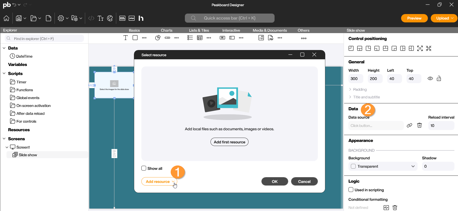
A Slideshow requires a source from which it can retrieve image data. Double-click the control to open the configuration dialog:
- Resource / Path (Data): Select the images from your local resources here (1). *Dynamic Link (Data): You can also bind the path to a data source. If the data source returns a list of paths, the slideshow will display them sequentially (2).
- The source can also be added under Data in the properties on the right side (3).
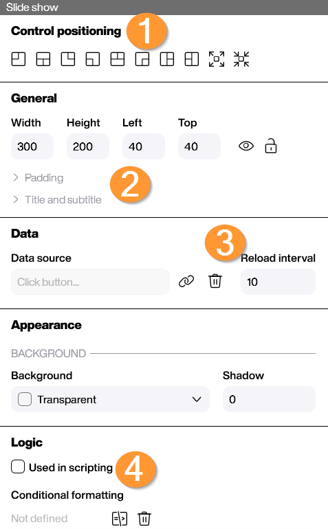
2 Appearance and Control
In the properties on the right side, you can precisely control the behavior of the slideshow and its visual presentation:
- Reload Interval (Data): Determine after how many seconds the next image should be displayed (3).