Controls
Button
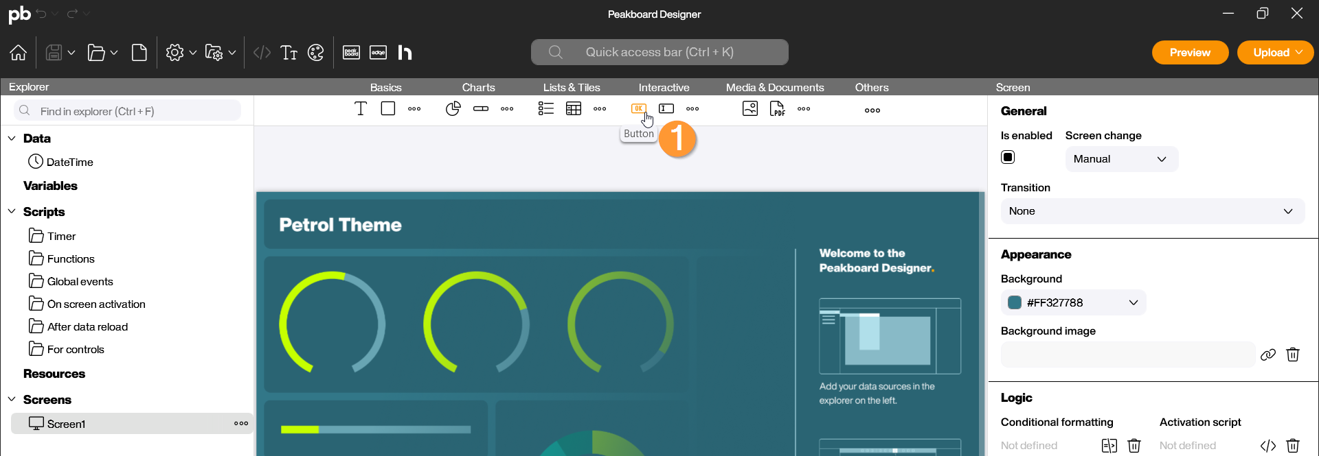
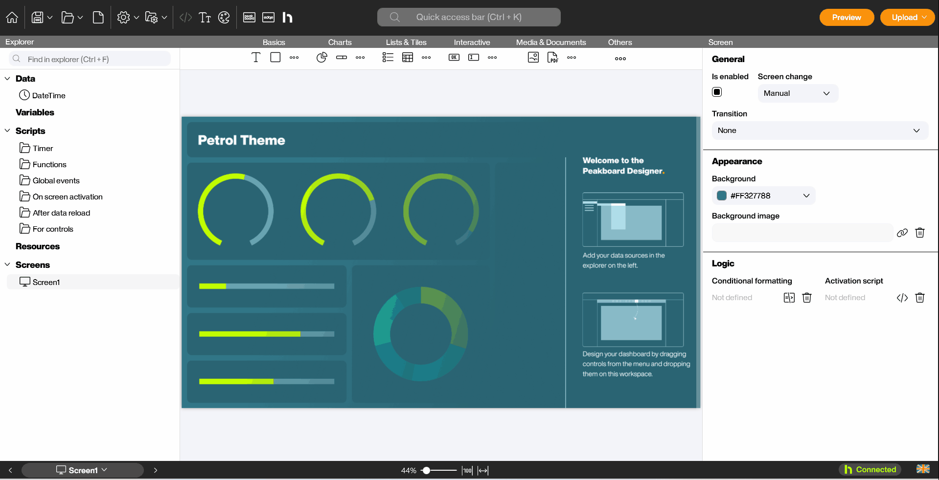
The Button control is an interactive element. While other controls often only represent data, the button allows the user to actively intervene in the process—whether by confirming processes, navigating through menus, or triggering scripts. You can find the Button control in the controls menu bar of the Peakboard Designer in the Input group (1).
Configuration and Properties
1 General and Data Binding
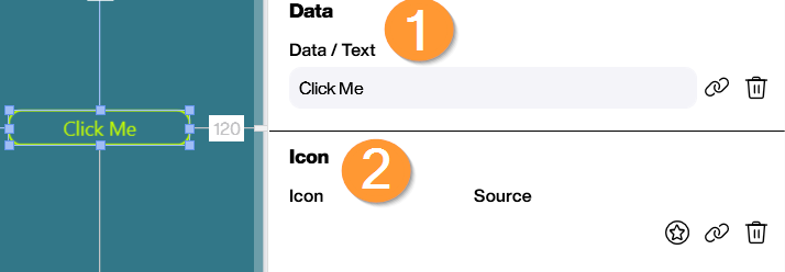
A button requires a label and a defined behavior upon interaction. Drag and drop the control or place it on your workspace with a double-click.
- Data/Text (Data): This is where the control receives its label. This text can be static or set dynamically via a data source or variable (1).
- Icon (Icon): Optionally, you can add an icon to the button to visually clarify its function (e.g., a save symbol or an arrow for navigation) (2).
2 Appearance and Control
Once you have selected the button in the Designer, you can make all specific settings in the properties on the right side. Among other things, you can design the visual look of the control on the workspace here:
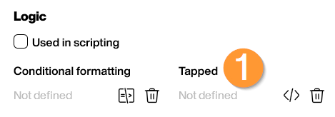
- Tapped (Logic): The button is the most versatile control in the Peakboard Designer. Countless processes can be implemented with it: With one click, you can switch between different screens, force data sources to refresh manually, write values into variables, flip through the pages of a PDF control, send HTTP requests to external APIs, toggle the visibility of warning messages, start or stop timers, and perform complex calculations based on user input (1).
Scripting
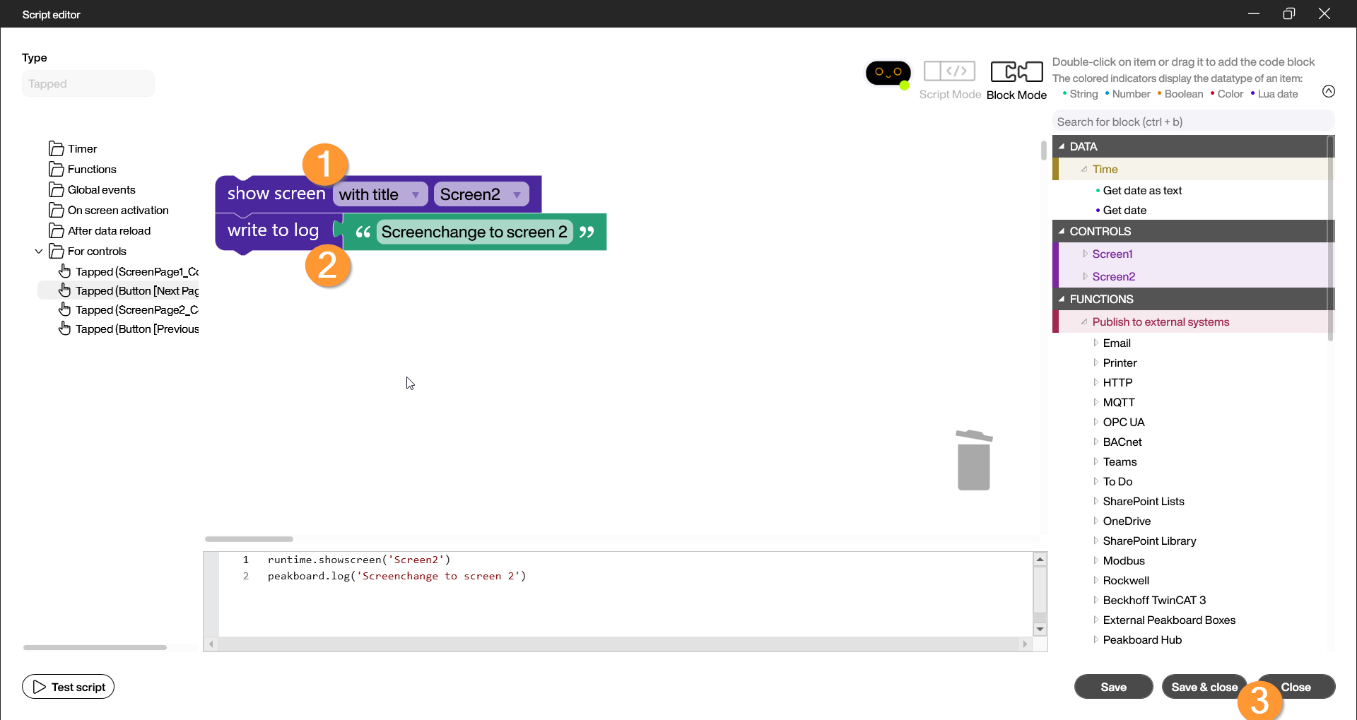
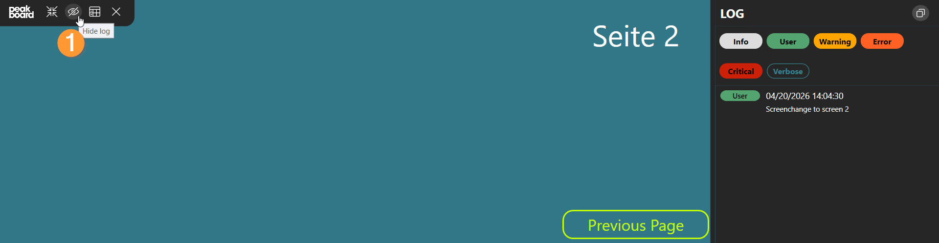
Example: Multi-action via button
In this example, a button is intended to simultaneously write a value to the log and trigger a screen change. To do this, we also add a text field for the page number to the visualization, the value of which will be written to the log. It is important to activate the “Use in scripts” property and assign a description to the text field control to clarify which value should be saved.
- Highlight the button and open the “Tapped” event in the “Logic” area on the bottom right.
- Select the “Switch screen” block code from the “Application” category and attach it to the existing block in the editor. To ensure that the correct screen is switched to, select the “with title” function in the dropdown of this block code and search for the screen you want to switch to when the button is activated (1).
- To also reflect the screen change in the log, place another “Write to log” block code under the existing block and change the content of the green text field to “Screen change to (Screen Name)” (2).
- Save the script via “Save and Close” (3).
Start the preview and check in the Log (1) to see if the values are returned correctly. Click the button to interact:
In this video, it is once again illustrated how the script for this example is structured and tested for successful functionality: