Controls
Shapes
The shape controls let you place basic graphic primitives such as rectangles, lines, or polygons on your screen. They are great for visually grouping areas, creating background panels, drawing separators, or acting as containers for interactive elements. Like every other control, you drag a shape from the control area onto the canvas. All common properties such as position, size, and conditional formatting are described in the article General properties.
Where to find the shapes
The shapes live in the [Basics] group. The Rectangle is visible by default; you reach all other shapes through the […] menu next to it.
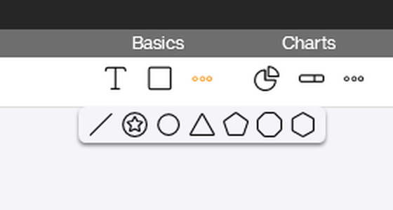
Seven shapes are available: Rectangle, Line, Ellipse, Triangle, Pentagon, Hexagon, and Octagon.
The individual shapes
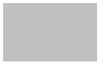
Rectangle
The Rectangle is the most flexible shape. The [Corner radius] property lets you round individual corners or all of them at once, so you can turn a sharp-edged rectangle into a rounded pill. Background, border, and shadow can be combined freely.
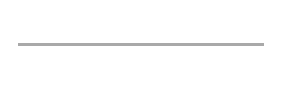
Line
The Line is a single horizontal segment whose length, thickness, and color you can adjust. It works well as a visual separator between content areas.
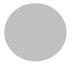
Ellipse
The Ellipse creates an oval area. When width and height are equal, it becomes a circle.
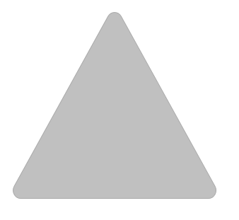
Triangle
The Triangle is drawn as an isosceles triangle pointing upward. Use the size values to stretch it in either direction.
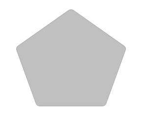
Pentagon
The Pentagon is a regular five-sided polygon and works well for stylised badges or status indicators.
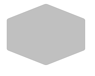
Hexagon
The Hexagon is a regular six-sided polygon. It is a popular choice for honeycomb grids or process diagrams.
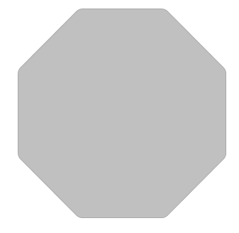
Octagon
The Octagon is a regular eight-sided polygon and visually resembles a stop sign.
Properties and interactivity
For every shape the properties panel on the right shows three sections: [General], [Appearance], and [Logic]. Under [Appearance] you configure background color, shadow, and – where applicable – border color and border thickness. The Rectangle additionally exposes [Corner radius].
Under [Logic] you can wire up a Tapped event: the script runs as soon as the user taps the shape on a touch screen or clicks it with the mouse. This lets you use shapes as buttons, hotspots, or filter areas without having to add a dedicated Button control. With [Conditional formatting] you can additionally bind background, border, and visibility to the state of a data source.