Controls
Image
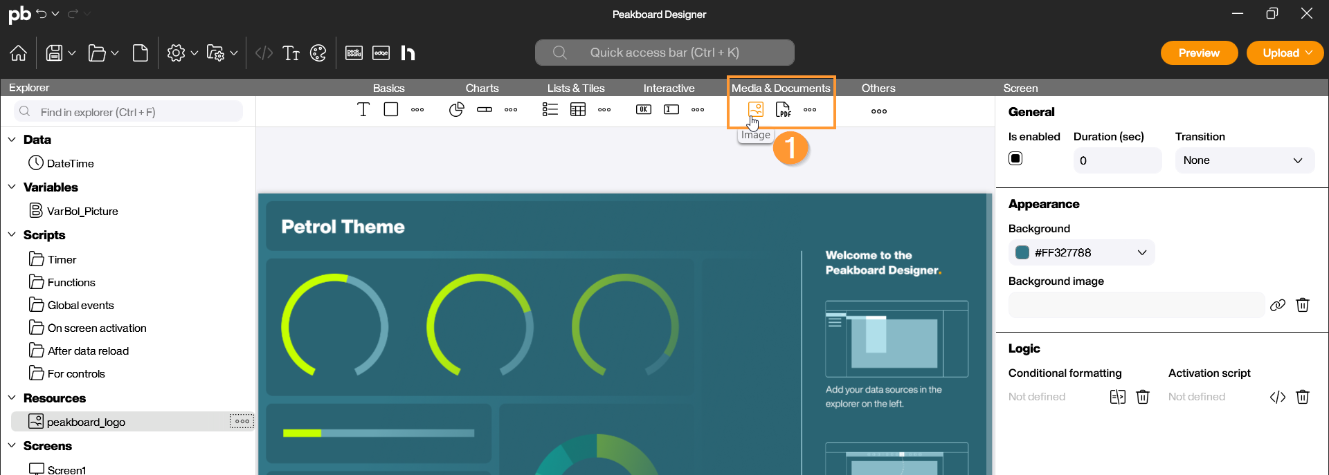
With the Image control, you can integrate graphics, logos, or photos into your visualization. In addition to the simple display of static images, Peakboard also enables the dynamic loading of image data from various sources such as web URLs, local network paths, or directly from a database. You can find the Image control in the Peakboard Designer in the Media & Documents group (1). Simply drag and drop the icon into your designer or place it on your workspace with a double-click.
Configuration and Properties
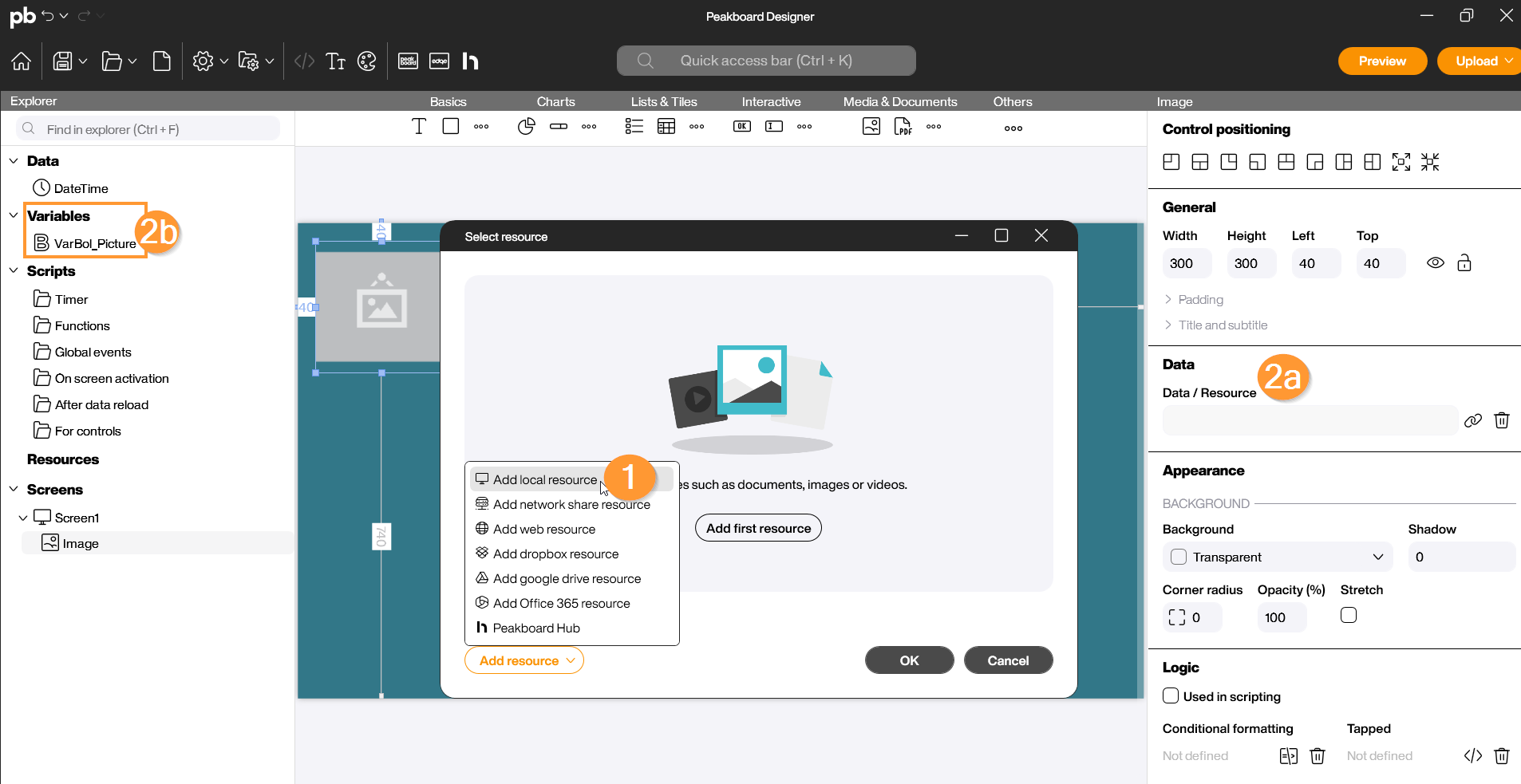
1 Data Source and Image Selection
An Image control can be filled with content in different ways. Double-click the control to open the configuration dialog:
- Static Resource: Select an image from your local resources that is permanently stored in the application (e.g., a company logo) (1).
- Dynamic Connection (Data Binding): Link the control to a data source or a variable that contains a path or a URL. The image will then be updated automatically at runtime (2a), (2b).
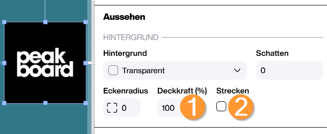
2 Appearance and Scaling
In the properties on the right side, you define how the image is displayed:
- Opacity (Appearance): Adjust the transparency of the image (0 to 100%) (1).
- Stretch (Appearance) (2): 2.1 Inactive: The image maintains its aspect ratio and is fitted into the frame. 2.2 Active: The image is stretched to fill the area exactly.
Scripting
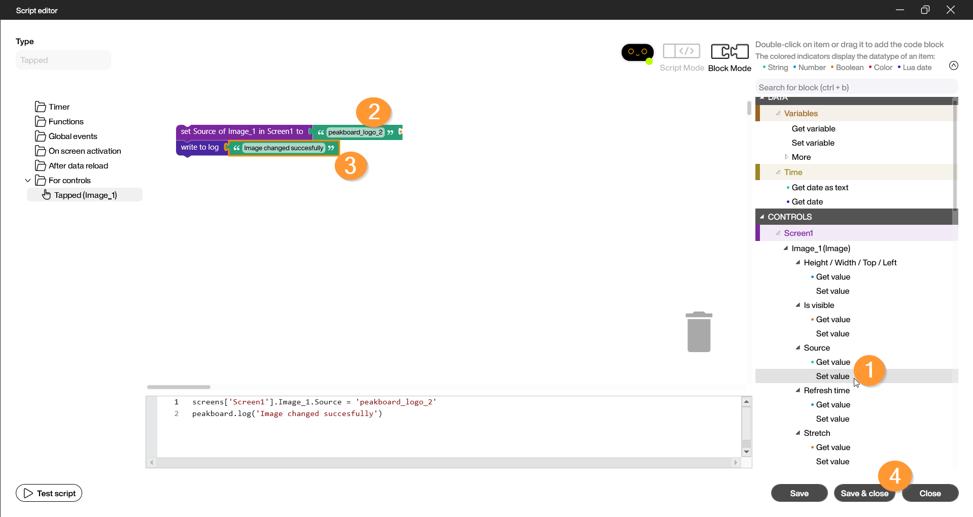
Example: Change image source via script, verify in the log
In this example, we change the image when a user clicks a button and have the successful change recorded in the log. To do this, add another image to the designer using one of the various connection modes (web URL, local, etc.). Ensure that the positioning frame remains a sufficient size for each image. Steps in the Script Editor:
- Open the script editor of the triggering element under Tapped.
- Under the category of your image control, select the “Set value” block under Source (1).
- You can now enter either a URL or the name of a resource (2).
- Under Functions, select the “Write to log” block and customize the text content (3).
- Close the editor by clicking “Save & Close” (4).
Start the preview and check the Log (second icon from the left) to see if the return value is correctly displayed after triggering.