Get started
The first application
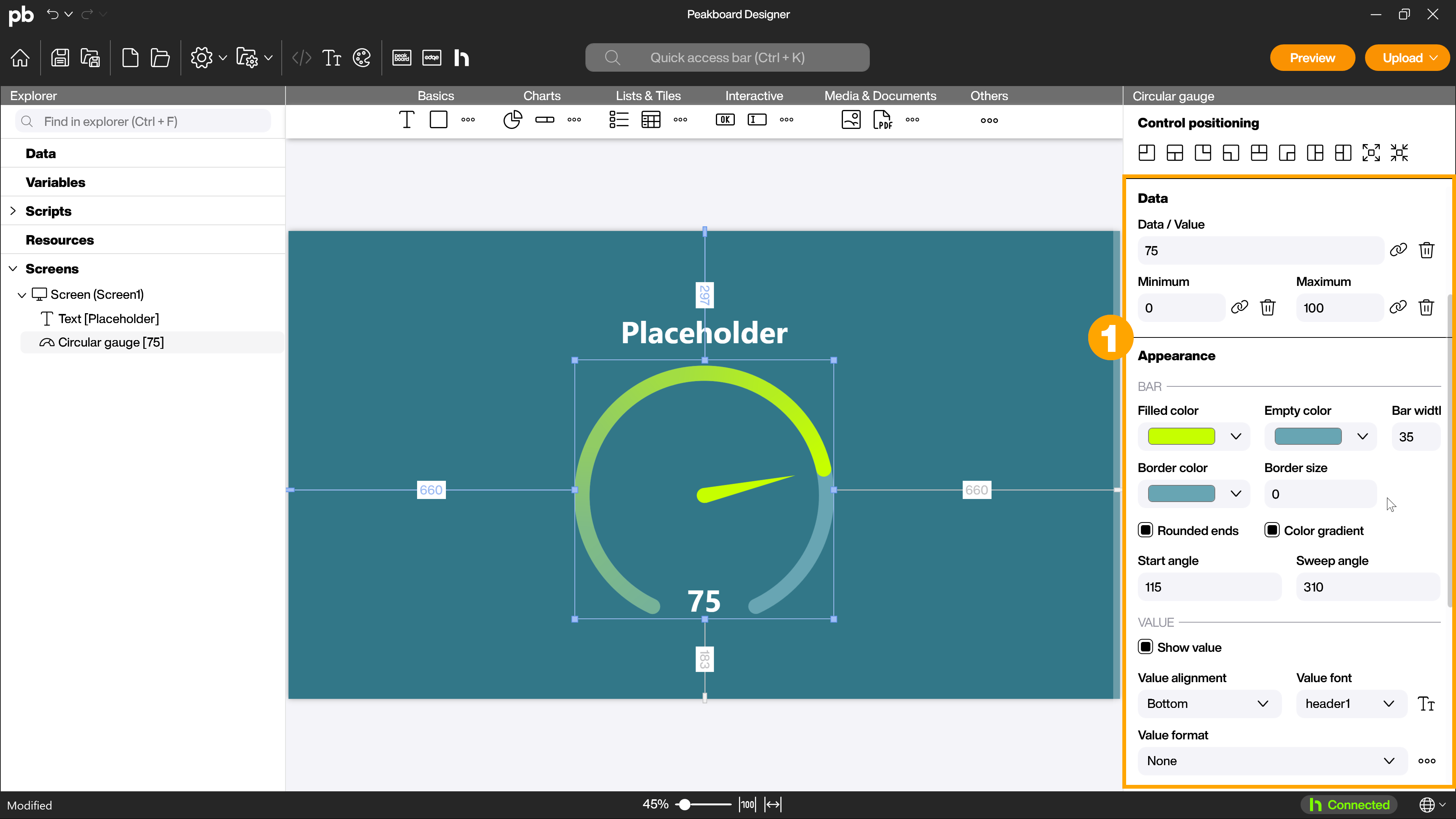
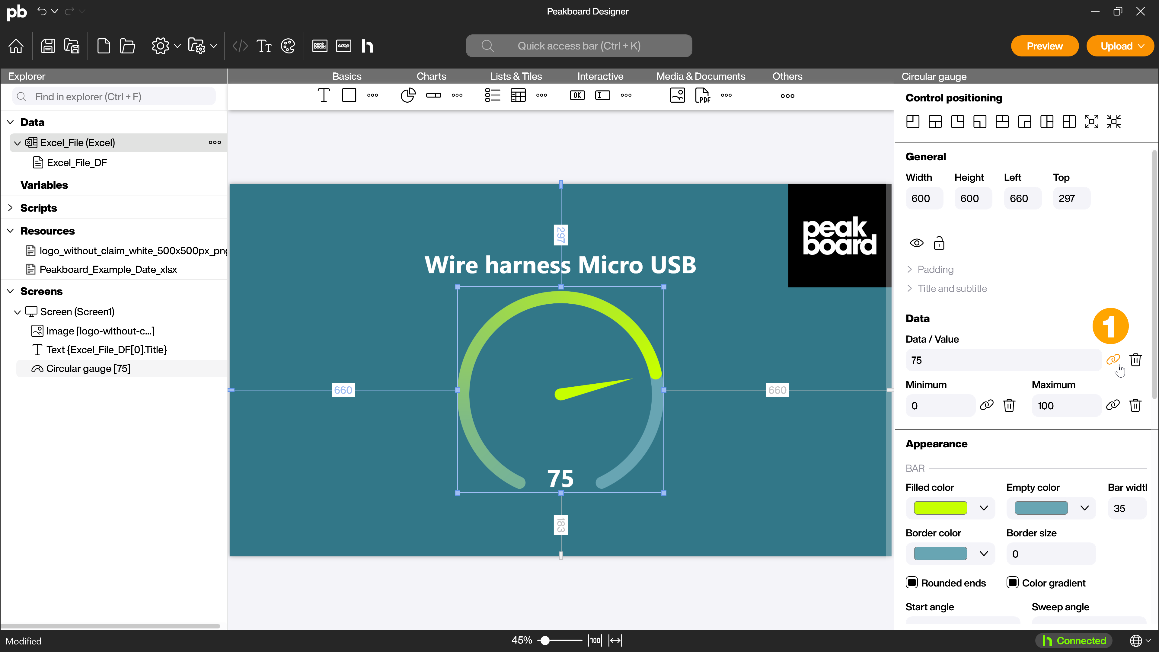
Now that you know the Peakboard Designer, it’s time to create your first application. First, drag and drop a [Text] control and define various settings in the attributes as well as the appearance of this control. For example, select the desired font, the alignment, and a text to be displayed. This text will later be replaced by a data set. Add a [Circular gauge diagram] from the [Diagram] group as your second control and adjust attributes such as bar width, value alignment or value font in the [Appearance] area here as well (1).
1.1 Use resources and images
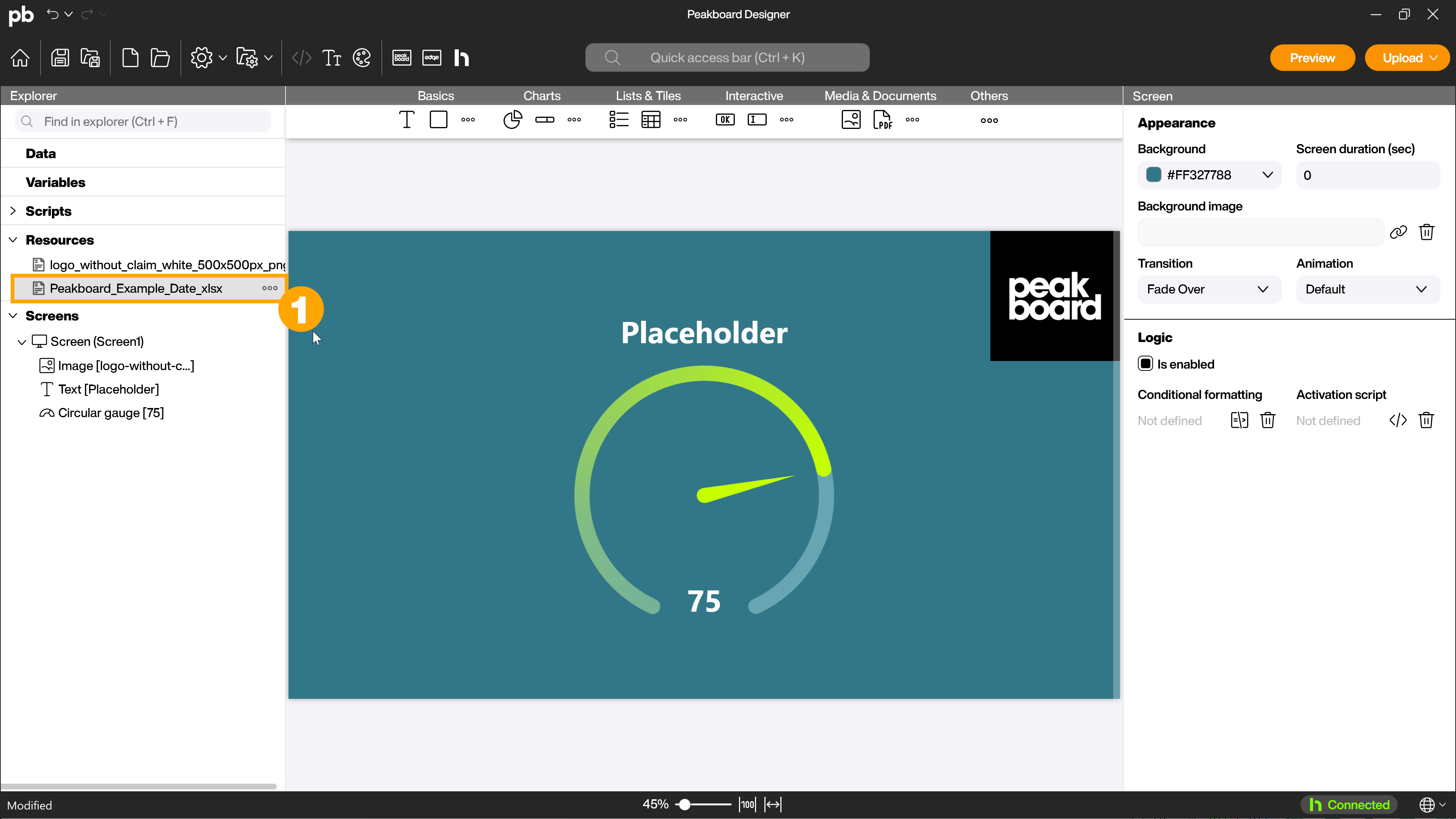
Use different file types in your application such as image files (JPG or PNG), PDFs or attach Excel files. For example, drag your logo as an image file to the explorer or go to the folder menu of the resources folder and add a local resource. Then you can drag and drop the file from the explorer to a free area of the workspace and specify size and position. For other data formats, the process works very similarly.
1.2 Connect data source
Easily connect a wide variety of data sources with Peakboard. From data formats like CSV, JSON and XML, databases and SAP to social media and machine, conveyor and sensor information like Siemens S7 and OPC UA. You can find an overview of the different data sources here.
In this example we use a Microsoft Excel file and load it directly into the project. The Excel file contains four products with five properties: title, product number, stock quantity, minimum stock and stock capacity. Download our example file and drag and drop it, just like the image before. Now the file is a resource in the explorer (1). If you later want to include Excel files from other locations, you can find out how to do this here.
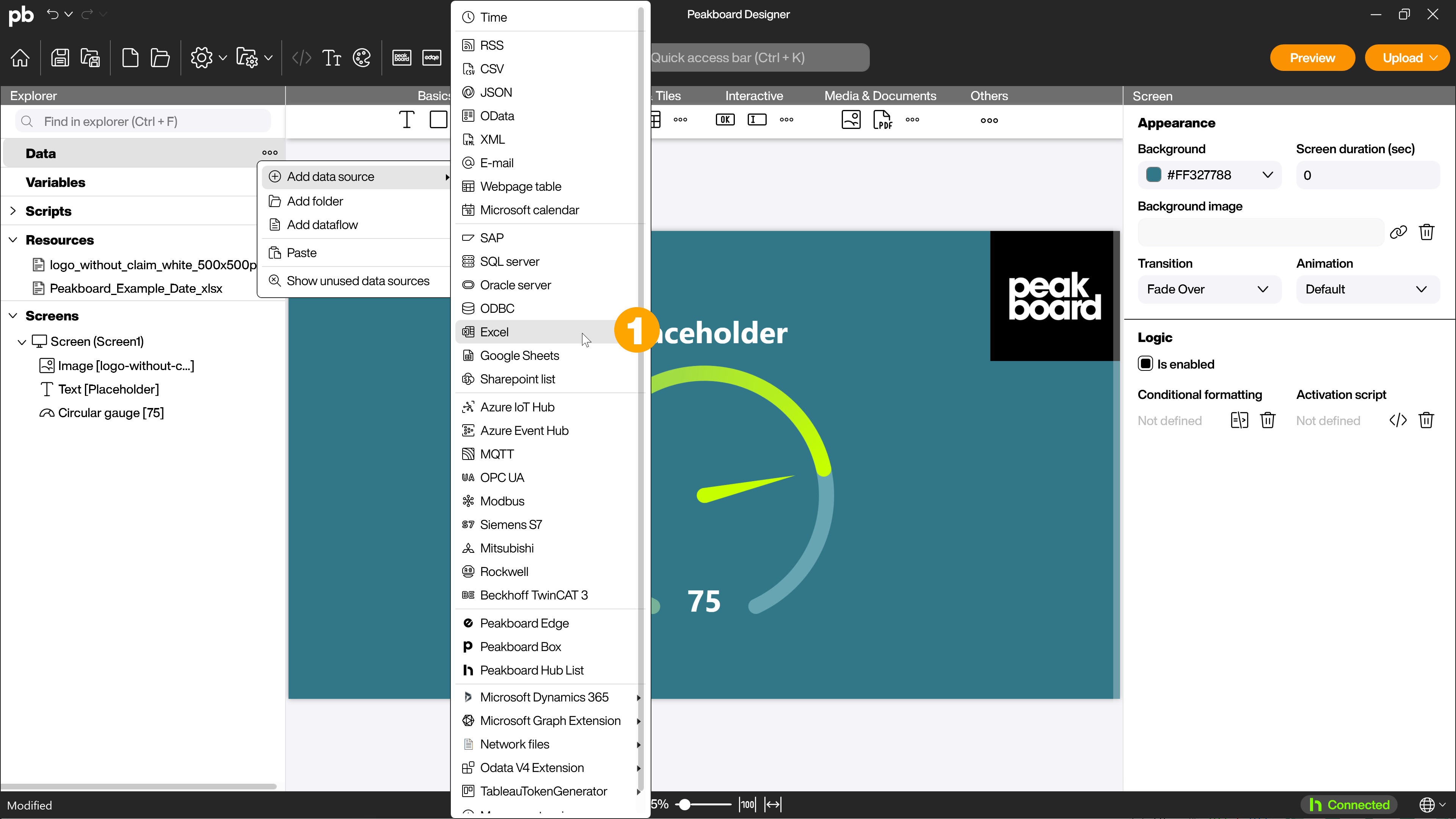
Now add the resource as a data source. To do this, right-click on the [Data] folder on the left or click on […] and select [Add data source] and [Excel] (1) from the menu.
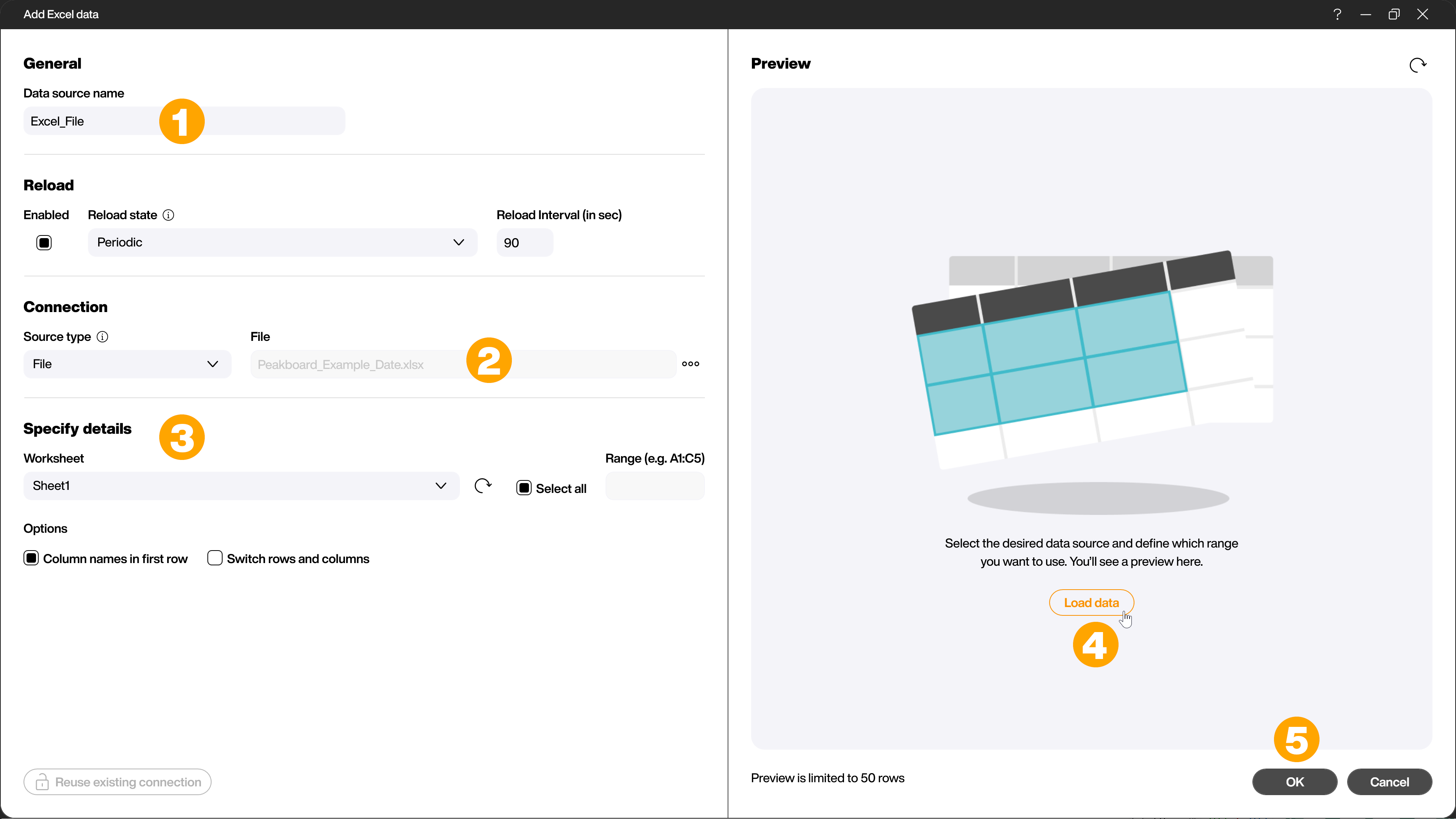
Now enter a name for the data source, for example [Excel_File] (1) and select the uploaded Excel file in the [Connection] area by clicking on the three dots behind the [File] input field (2). Now define under [Specify details] (3) which worksheet is to be used and whether there are headings in the first row, as is the case here. With [Load data] (4) you can check the data for plausibility before confirming with [OK] (5).
Voilà, you have just connected your first data source.
1.3 Apply dataflow to data source
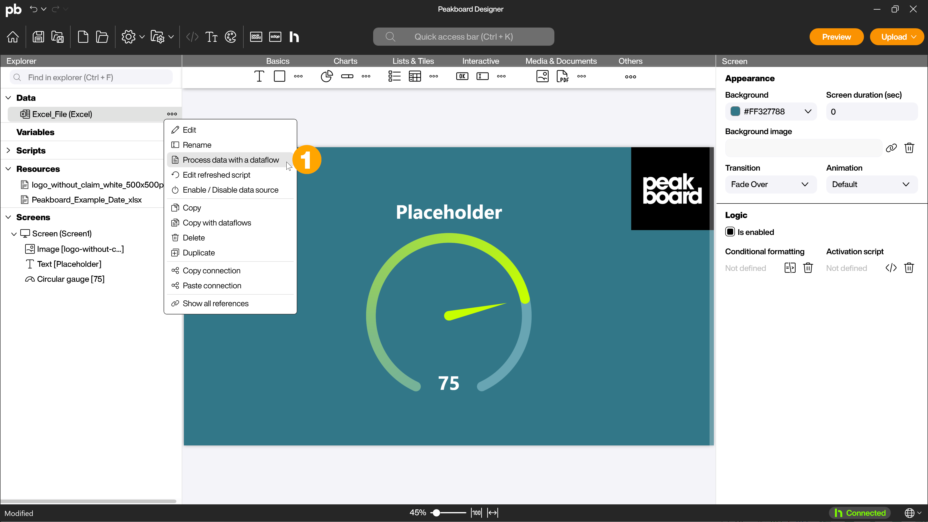
For the next steps, change the data type of the last three columns of the table from [String] to [Number]. To do this, right-click on the data source and [Process data with a dataflow] (1) to create a dataflow.
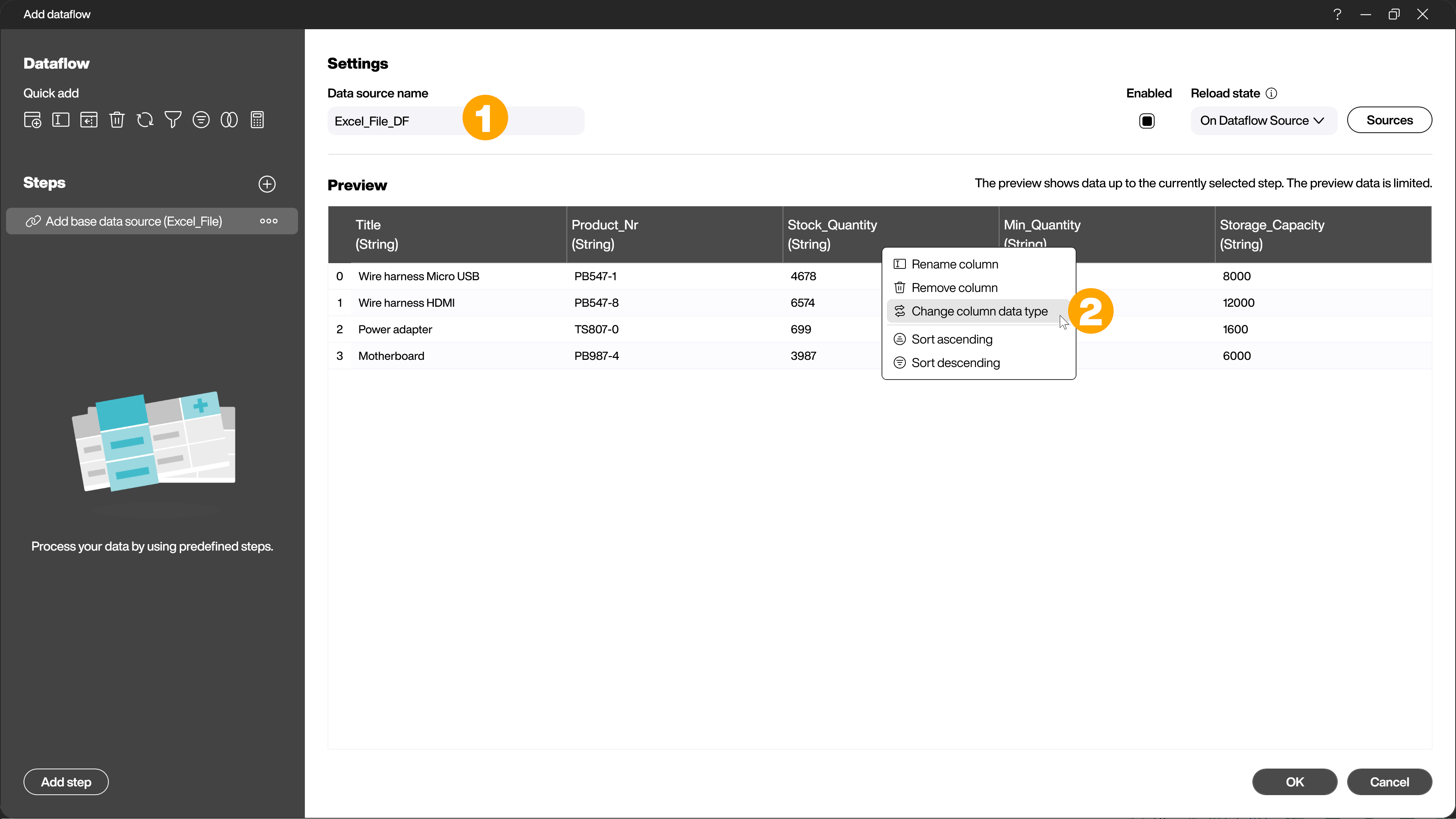
First give the data source a name, for example [Excel_File_DF] (1). Right-click on the column name and click on [Change column data type] (2) to add a step to change the column data types and the dialog will open.
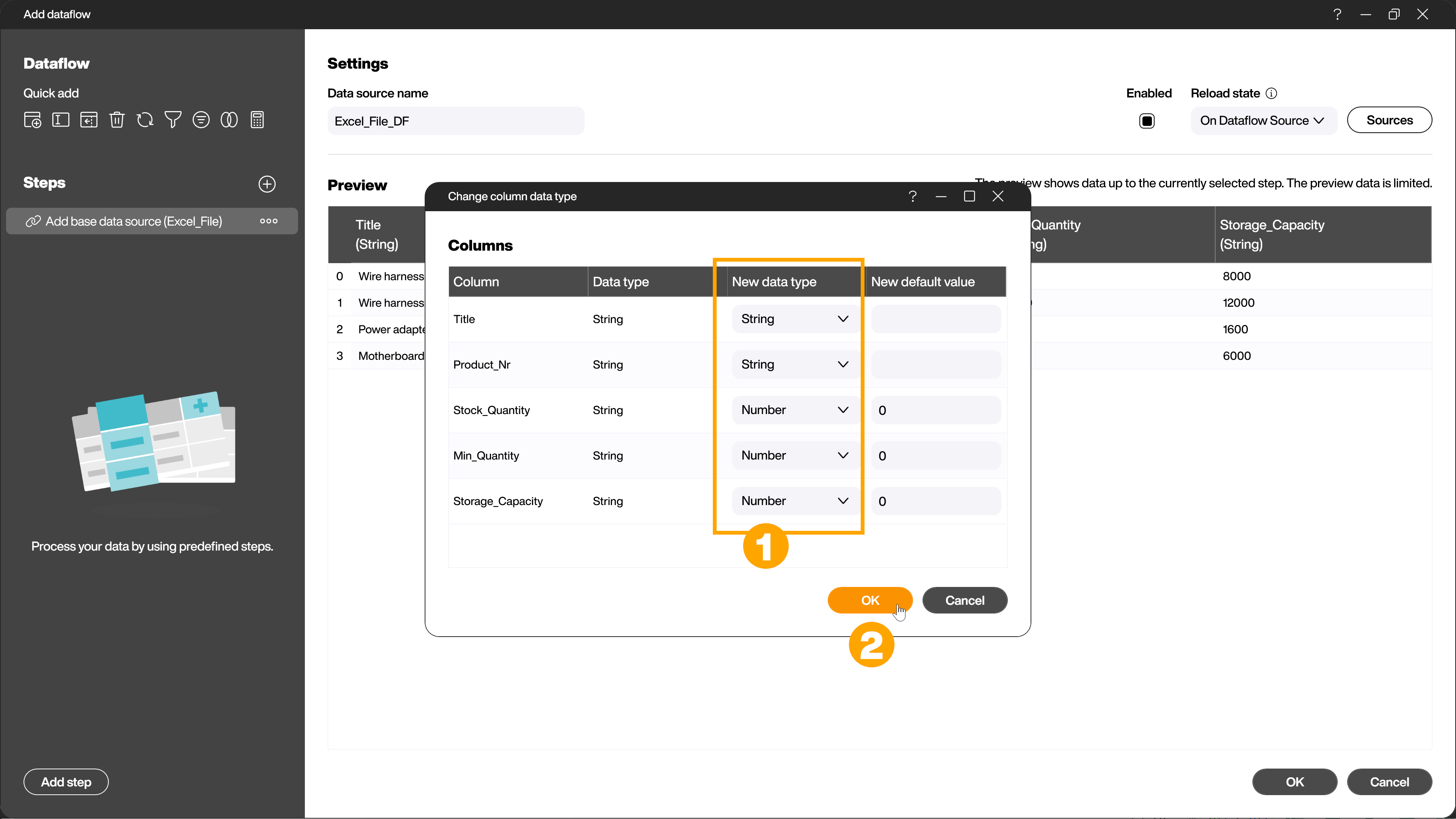
Select the desired data type (1) and confirm with [OK] (2).
1.4 Connect data and control
The last step is to connect the data source to a control. Select a control in the explorer or by clicking on the workspace, in this case the text field. On the right side in the attributes you will find the attribute [Text]. Click on the brackets symbol (1). Now select the data source and the desired column (Title) and row (1), in this case row 0 and column [Title] for the heading. Note that in information technology counting starts at 0, so row 0 is the first row. The row with the headings is ignored. Now the content of this cell of your data source will be displayed inside the textbox.
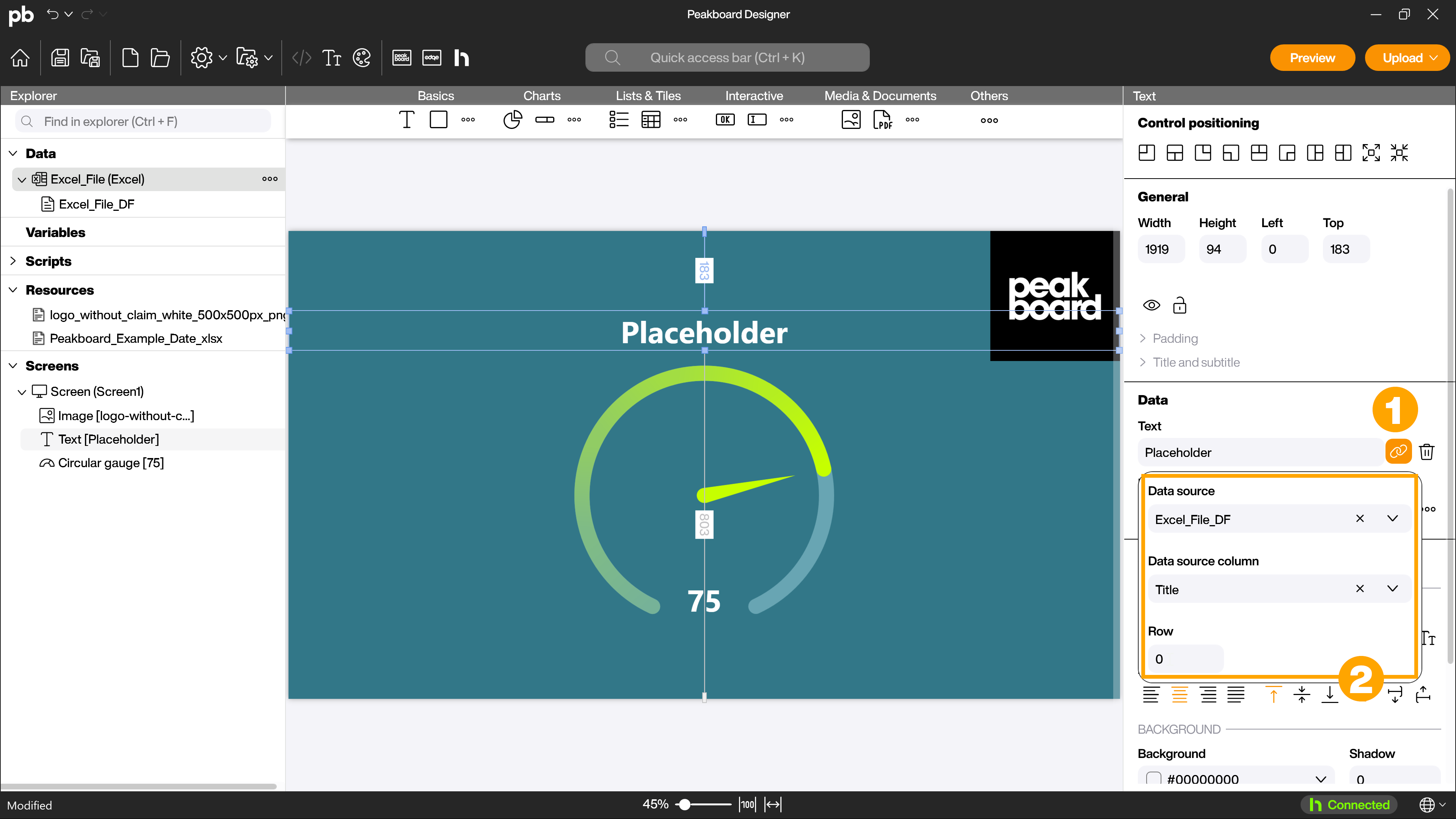
Now connect the data source to the gauge diagram. To do this, click on the brackets symbol (1) next to the values in the attributes and select the dataflow of the Excel data source. Define the [Stock_Quantity] column for the [Data / Value] field, the [Min_Quantity] column for the [Minimum] field and the [Storage_Capacity] column for [Maximum].
1.5 Preview
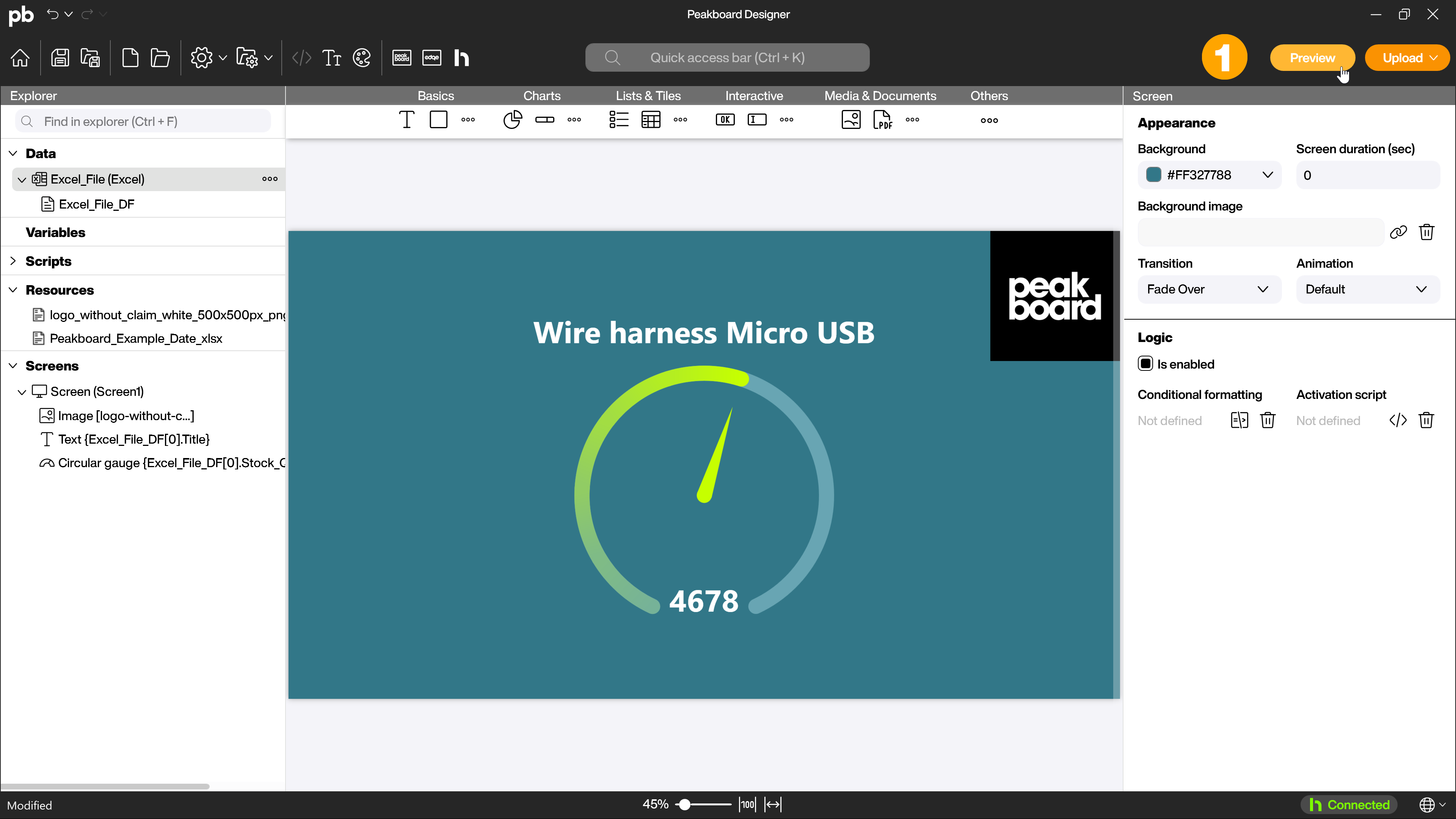
You did it! Your first application with Peakboard is ready. Click on [Preview] (1) in the menu bar to view it.
A new dialog will open showing you the result. This application can now be transferred to your Peakboard Box.
1.6 Project colors
If you do not like the color of the finished application or if changed working conditions require a different color scheme, for example, you can easily and centrally adjust the colors in the project color management. To do this, click on the Project Colors button in the menu bar and then select a new, suitable theme. Alternatively, you can also change only individual aspects of your application centrally.
2. Next step
If you already have a Peakboard Box, the article The Peakboard Box will help you with your next steps.
If you have problems with the Peakboard Designer, don’t hesitate to contact us. We wish you a lot of fun and success with Peakboard!