Controls
Diagram
In the charts section you will find different types of charts that you can use for your applications.
- Diagram - A selection of different chart types described in this article.
- Linear gauge - A chart that you can use for example to display progress in linear form
- Circular gauge - A chart with which you can for example display utilization in circular form
- Signal lamp - A signal that can be controlled using simple signal rules
- Timeline grid - You can use the timeline grid to display different states over time
- Excel chart - With the Excel chart control you can directly integrate existing charts from Excel files
Add a chart control to your application
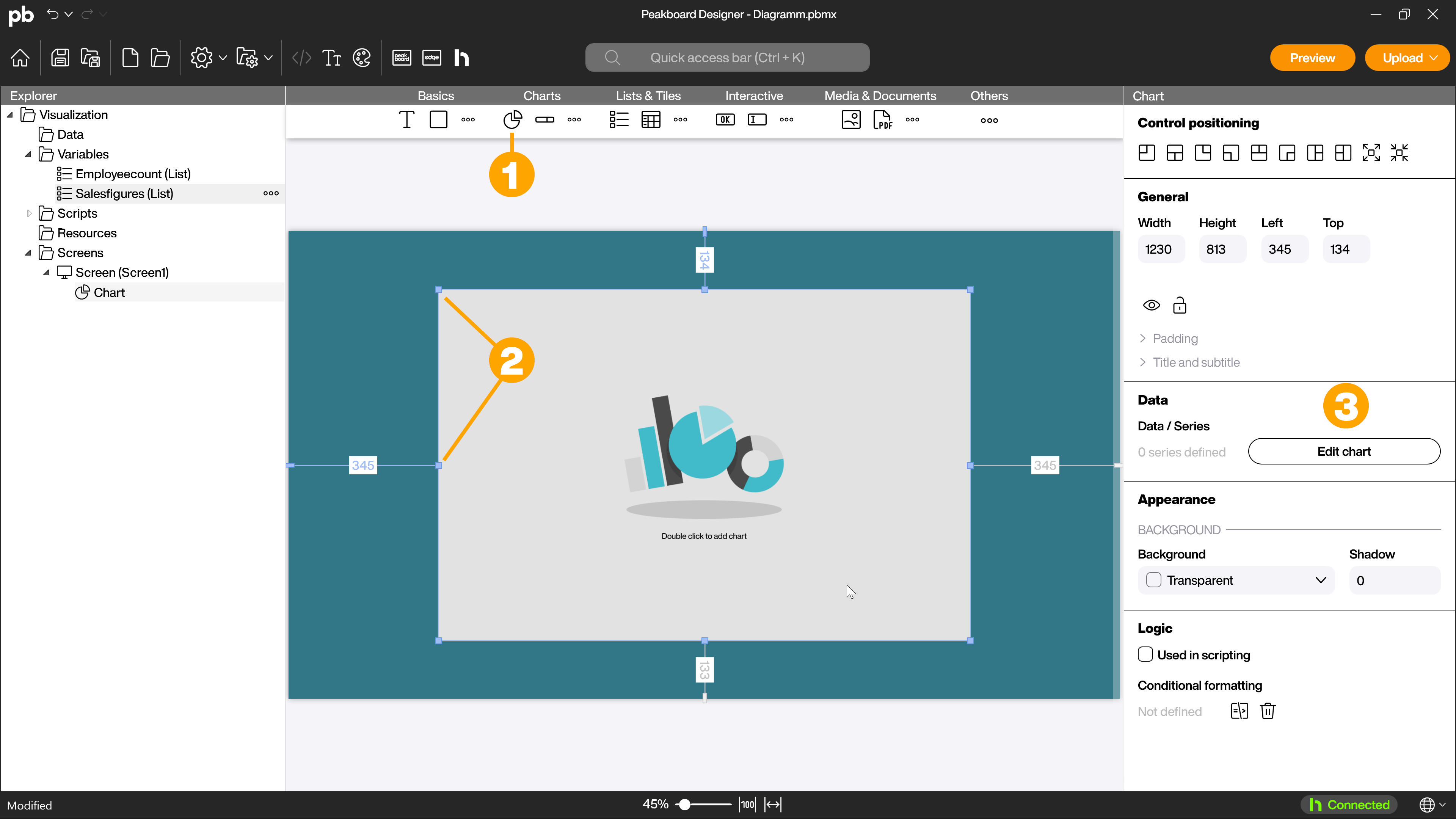
To add a diagram, drag and drop the control (1) onto the workspace. You can determine the positioning by dragging the corners and sides (2). Then double-click on the control to access the selection menu for the various diagram types. Alternatively, click on the [Edit chart] button (3) in the attributes to access the dialog.
Select a chart type
In the selection window of the chart control, select the first chart type you want to add.
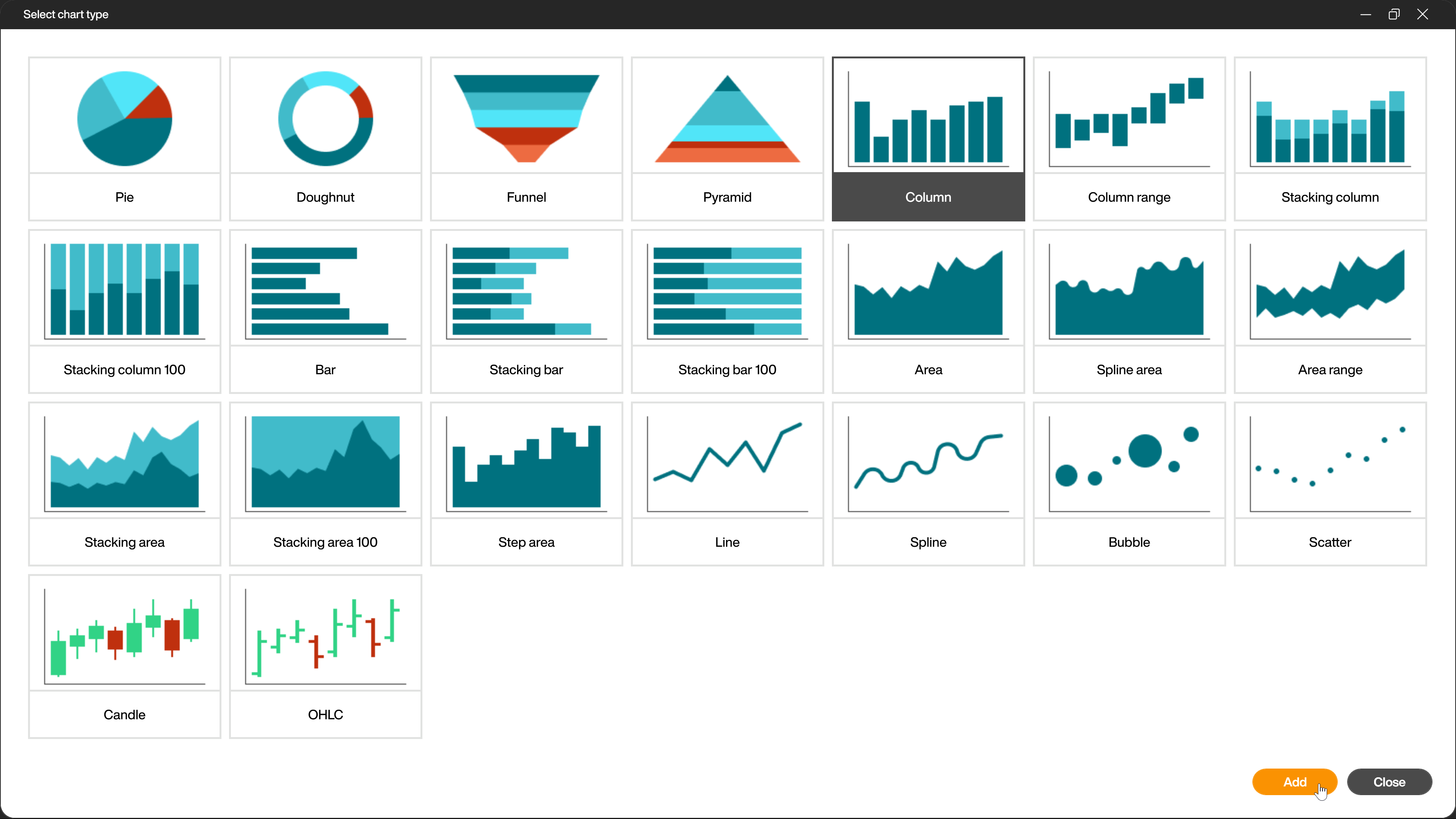
You can overlay several identical or different chart types in a control and align them on a common axis. The data you want to use for the chart must match the selected chart type. If necessary, you can prepare your data with a dataflow.
General settings for all chart types
The settings dialog for the various chart types is largely identical and differs only in individual, specific setting options for the chart types.
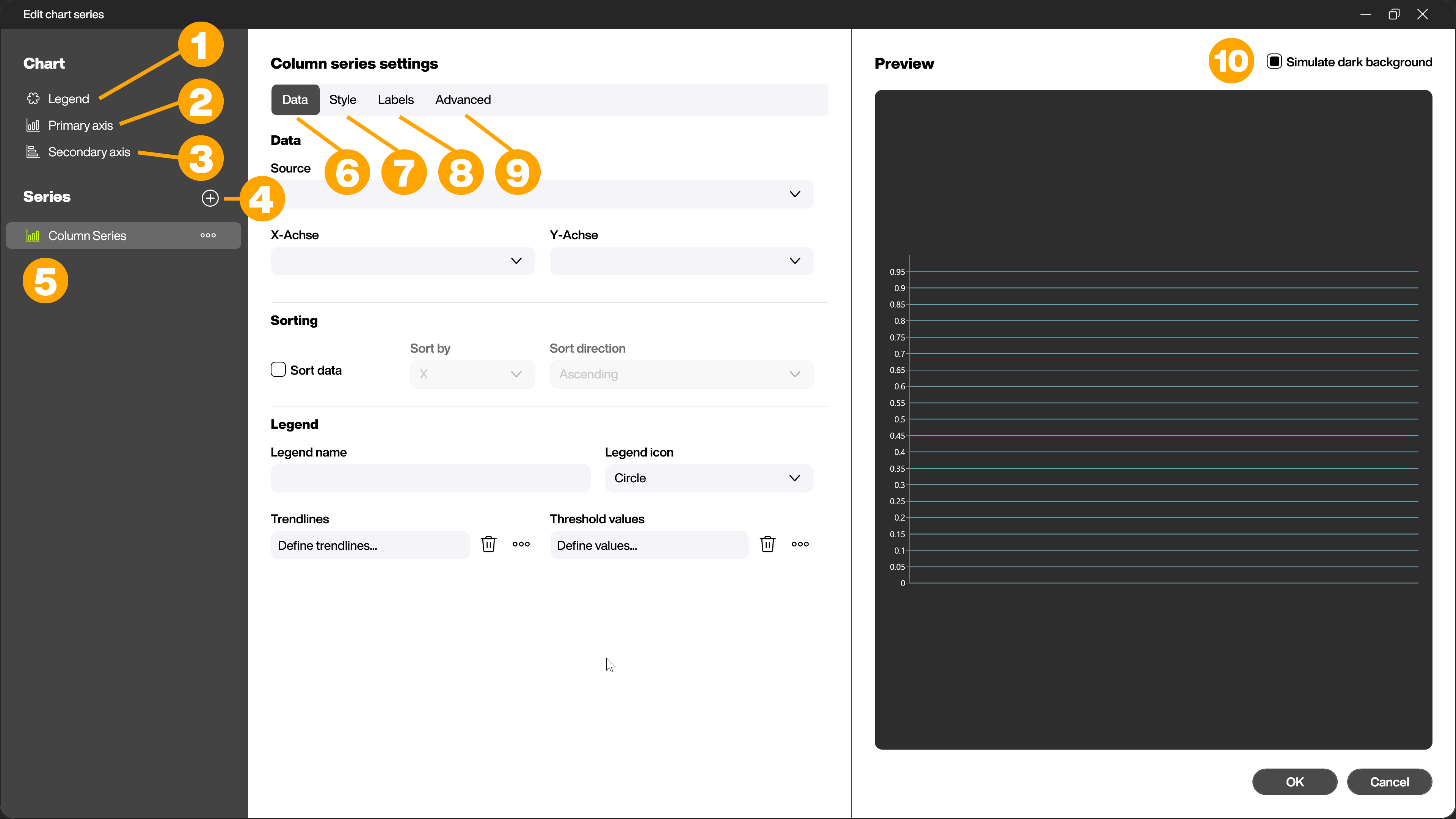
In the left-hand area of the dialog, you will find menu items for creating a legend (1) for the chart control and, if applicable for the chart type, the menu items for setting the primary (2) and secondary (3) axes. You can add another series there (4) and select the series already added (5).
In the middle area, you make the settings for the selected series. The tabs Data (6), Style (7), Labels (8) and Advanced (9) are available for selection.
In the right-hand area, you will see a preview with the available data and selected settings. Here you can use the checkbox (10) to switch between a light and dark background in order to better assess the contrast in your application.
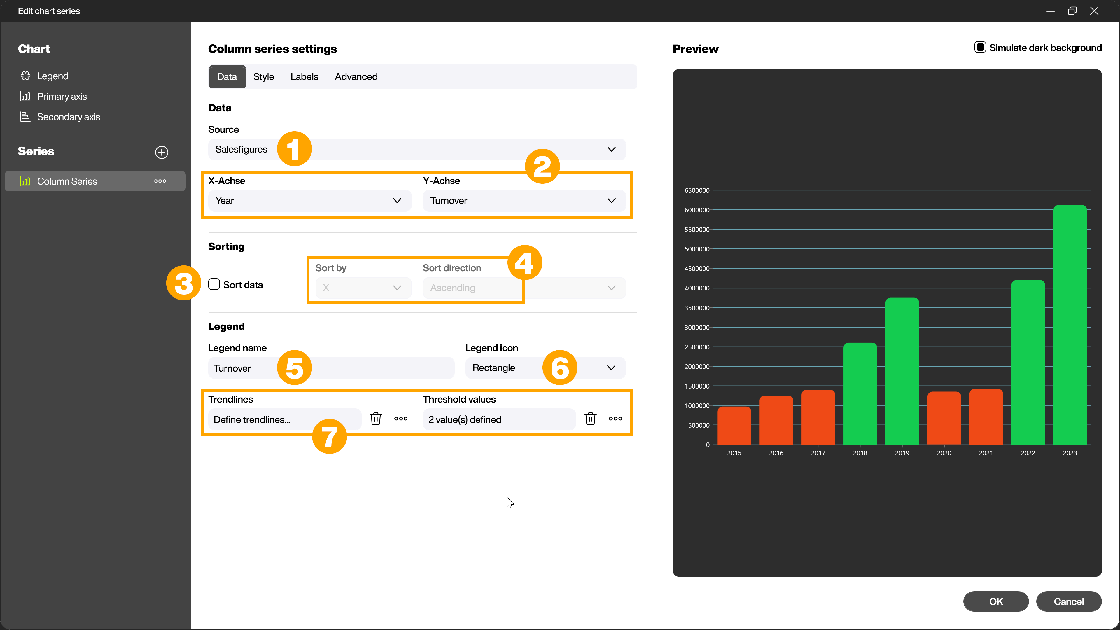
Data - Link the data source for the chart
In the first step, link your data source to your selected chart series in the [Data] tab. To do this, select the data source via the drop-down menu [Source] (1). The contents of the data source are automatically recognized and you can select them via the other drop-down menus (2) in the [Data] area. The options differ depending on the chart type and require a corresponding structure of the data source.
Note:
For the x axis, values with the data type Number and String are permitted, for the y axis only values of the data type Number are permitted! Use Dataflows to change the desired column to the required data type.
In the [Sorting] area, you can specify whether (3) and how (4) the linked data should be sorted.
In the [Legend] area, assign a legend name (5) and specify the legend icon (6). Depending on the selected chart type, you can also define further settings (7) such as trend lines and threshold values in this area.
Style - Make color settings for your chart
In the [Style] tab, you define the colors that are used in your chart. To do this, click the [Select] button (1) in the [Diagram colors] area. You can either select from ready-made color palettes or define your own desired colors in the dialog that now opens. Use the checkbox (2) to specify whether the colors should be displayed as gradients.
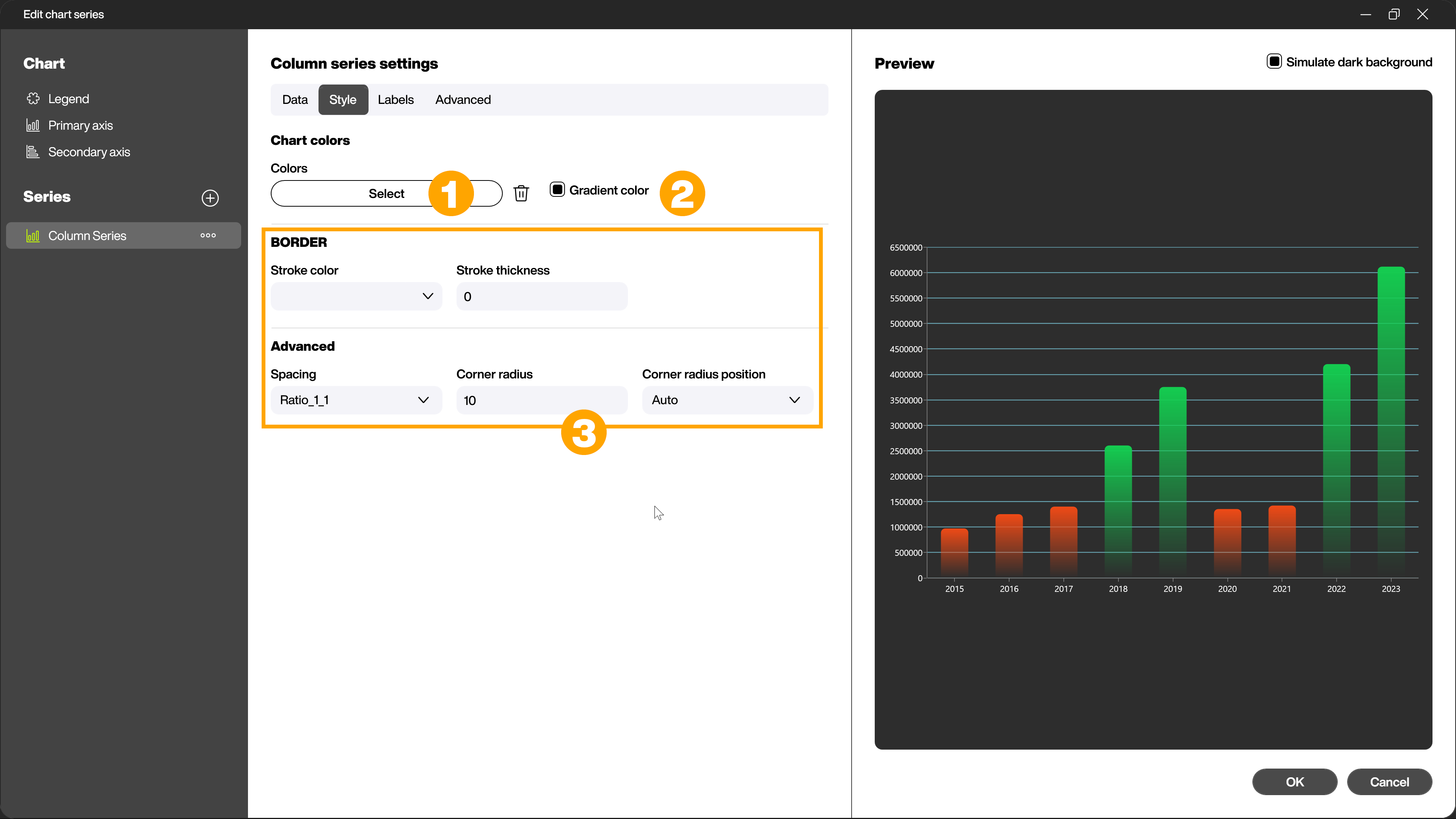
Depending on the selected chart type, there are further specific setting options in the [Style] tab (3). For example, you can create distances between bars and corner radii for bars, or explode the selected series and thus further refine the appearance of your chart.
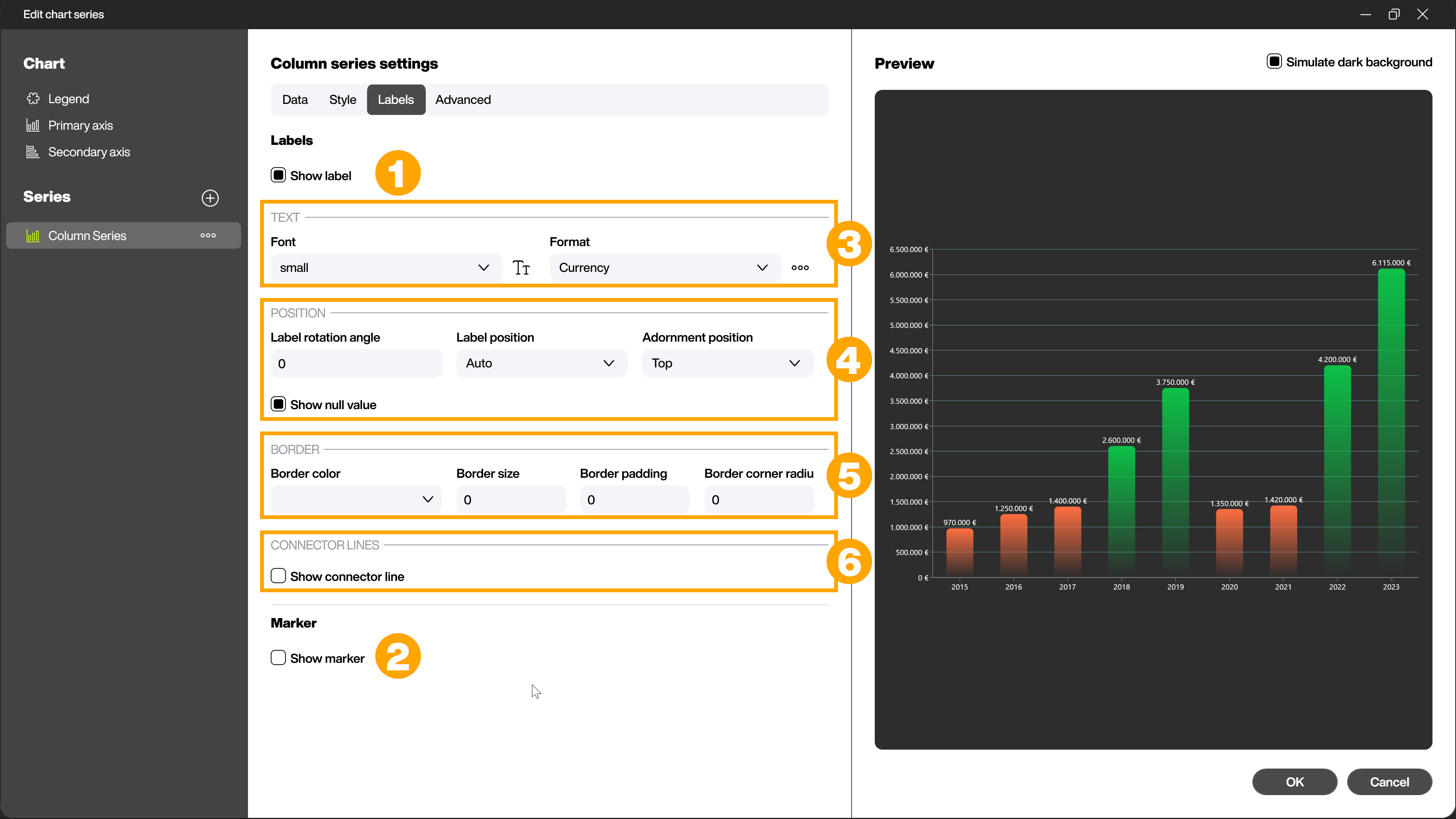
Labels - Design labels and markers
In the [Labels] tab, you can use the checkboxes to select whether [Labels] (1) and [Markers] (2) should be displayed for the current chart.
If a checkbox is activated, the other setting options are displayed. In the [Label] area, you can make settings for the text (3), such as the font used and the format. Various standard formats are available here, such as currency or percentages. You can define the position of the labels (4) and add outlines (5) and connecting lines (6). In the [Markers] area, you can define how the markers for values should look in the chart.
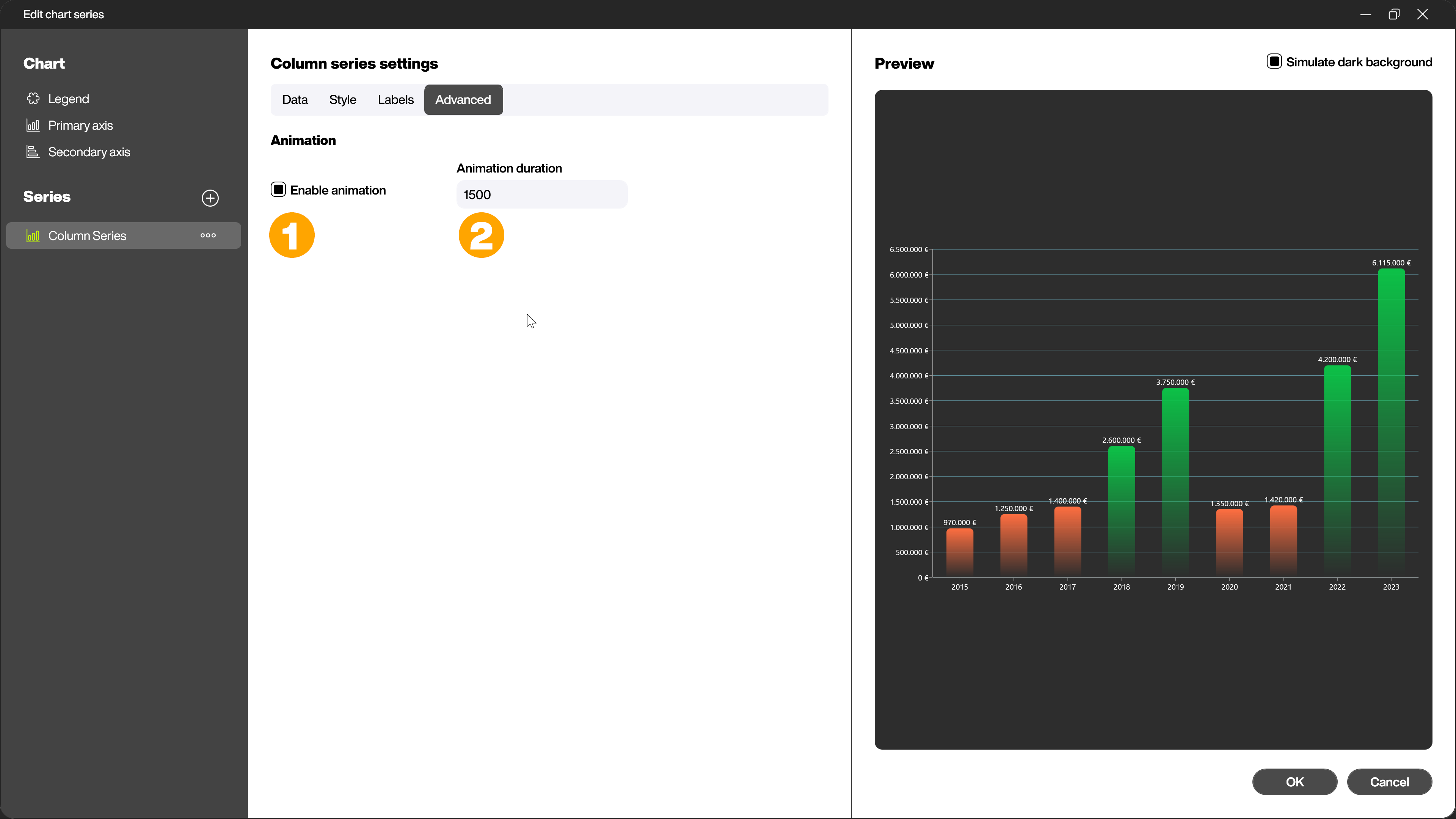
Advanced - Animate the chart
In the Advanced section, you can activate or deactivate the animation of the chart using the checkbox (1) and set the length of the animation in milliseconds (2).
Charts with multiple series
You can combine several series in one chart. You can use the same diagram types as well as partially different diagram types. Common axes are a prerequisite for combining several series in one chart. One axis must be identical and the values of the second axis must be in a similar range in order to achieve a useful representation.
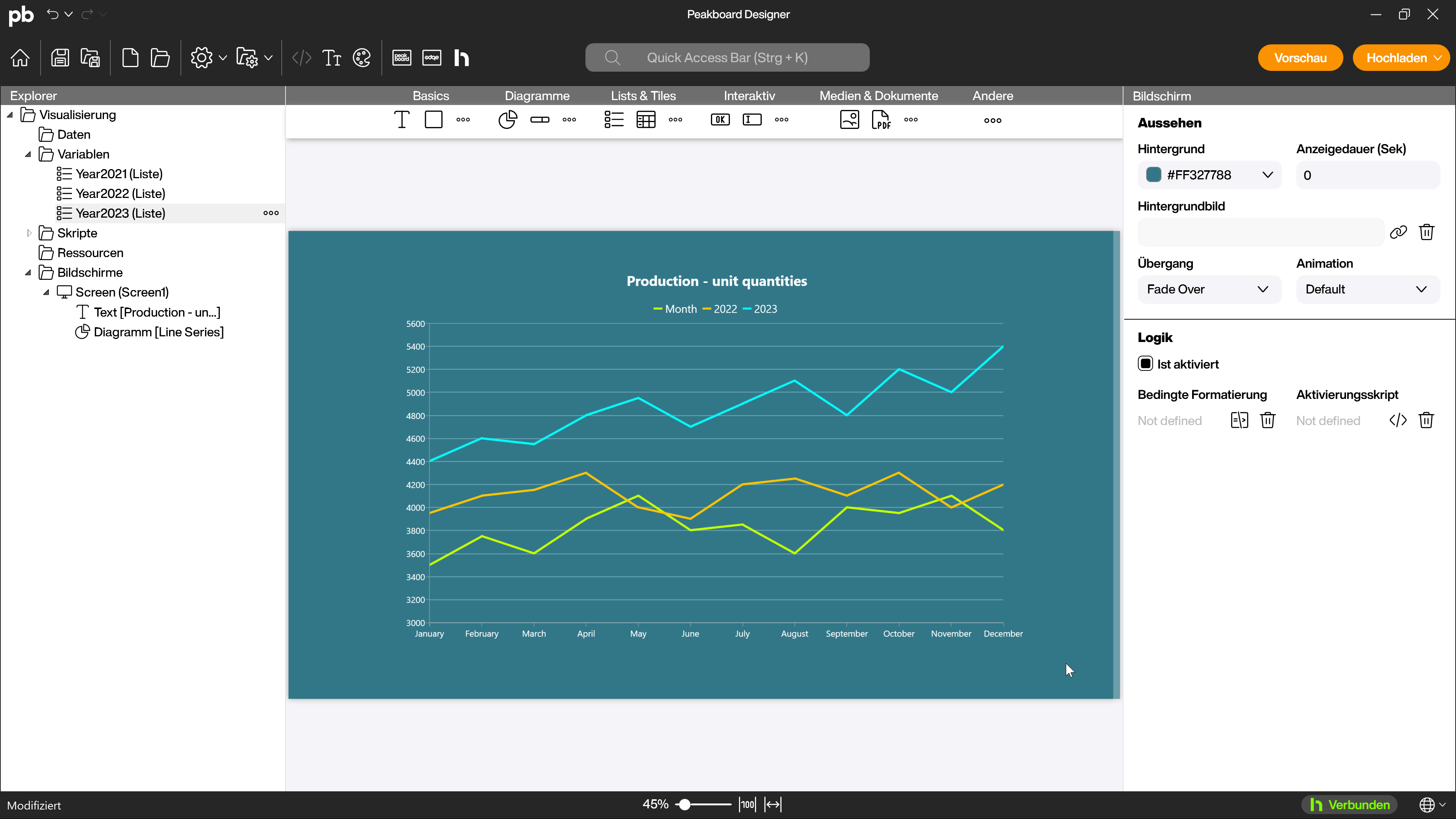
In this first example, several line charts have been combined as series to compare the values over several years. The common axis is the months, each line chart series corresponds to the values of one year and the values are in a similar range.
Another example of combining several series are the stacked columns and similar stacked charts. You can use them, for example, to display the total production of a day and at the same time the distribution across several machines.
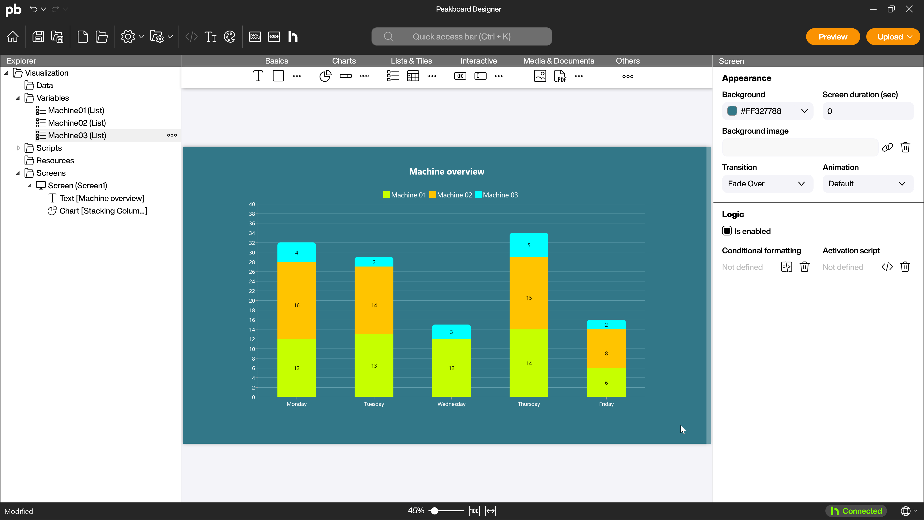
The common axis is the days of the week. The shares of the individual machines are the series used. These are stacked on top of each other and thus show at a glance both the total quantity produced and the distribution between the different machines.