Controls
Date Picker
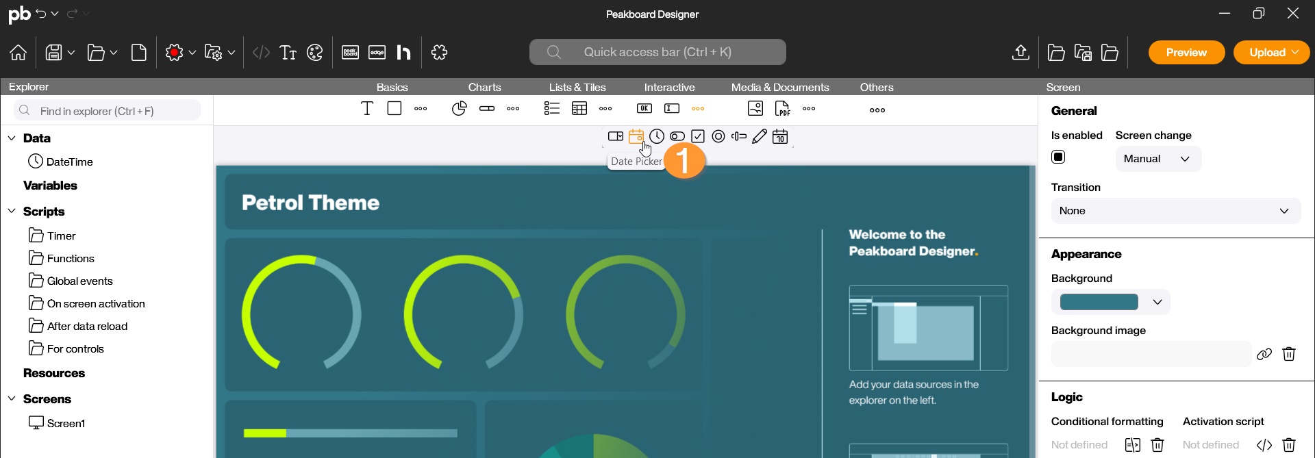
The Date Picker control is an interactive input element that allows a date to be conveniently selected via a calendar dialog. This is particularly useful for applications where data needs to be filtered (e.g., shift reports or logistics data) or where timestamps for manual bookings need to be set. You can find the Date Picker in the Peakboard Designer in the Interactive group (1). Drag and drop the icon into your designer or place it on your workspace with a double-click.
Configuration and Properties
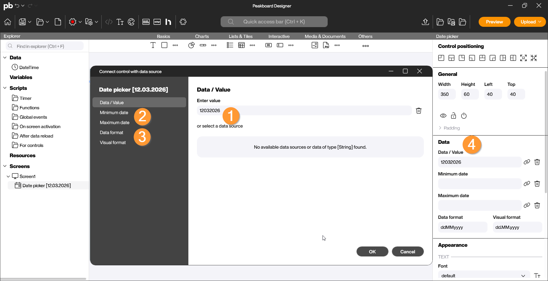
1 Data Source and Selection
A Date Picker usually requires a predefined start value and can optionally be restricted in its selectable range. Double-click the control to open the configuration dialog:
- Data/Enter value: Determine which date should be displayed by default when the visualization starts. You can choose a fixed date (e.g., the current date) or bind the value dynamically to a data source (1).
- Min/Max Date: Limit the time period the user can select to avoid incorrect entries (e.g., only dates in the past or only in the current year). To do this, specify the minimum (earliest) and maximum (latest) date (2).
- Data format/Display format: Determine the format in which the date is displayed in the input field (e.g., ddMMyyyy for Germany or MMddyyyy for international use) (3).
- Note: This specification can also be made in the control’s properties on the right side (4).
Scripting
The Date Picker control provides access to the selected date for use in calculations or changes.
Example: Save selected date in a variable
In this example, we use the “TextChanged” event of the Date Picker to update a label or a data source with every new selection.
Steps in the Script Editor:
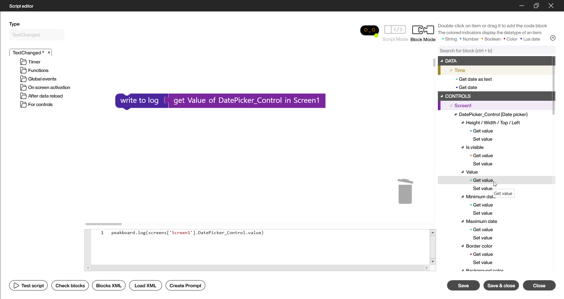
- In the Designer, open the script editor on the bottom right under Logic and TextChanged.
- Select the “get value” block in the Screen section under the name you assigned to the control (here “DatePicker_Control”) and place it on the script editor area.
- Link this value to another control (e.g., a text field) or write it to the log. To do this, select the “Write to log” block from the Peakboard Box category, drag it onto the workspace, delete the default content, and link the two blocks.
- Save the script by clicking “Save and Close”.
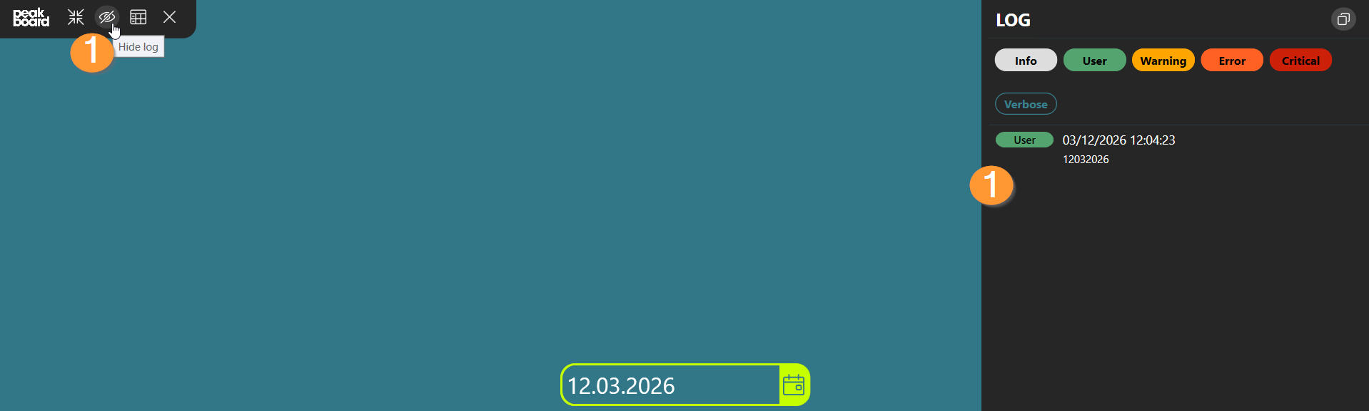
Start the preview and check the Log (1) to see if the return value is correctly returned depending on the content of the control. This is provided in number format.
In this video, it is once again illustrated how the script for this example is built and tested for successful functionality: