Controls
Text box
Note. To display values or KPIs you should always use the Text Control!
The text box, unlike the Text control, also allows you to make text entries. To add the text box drag and drop it onto the workspace.
Text box properties
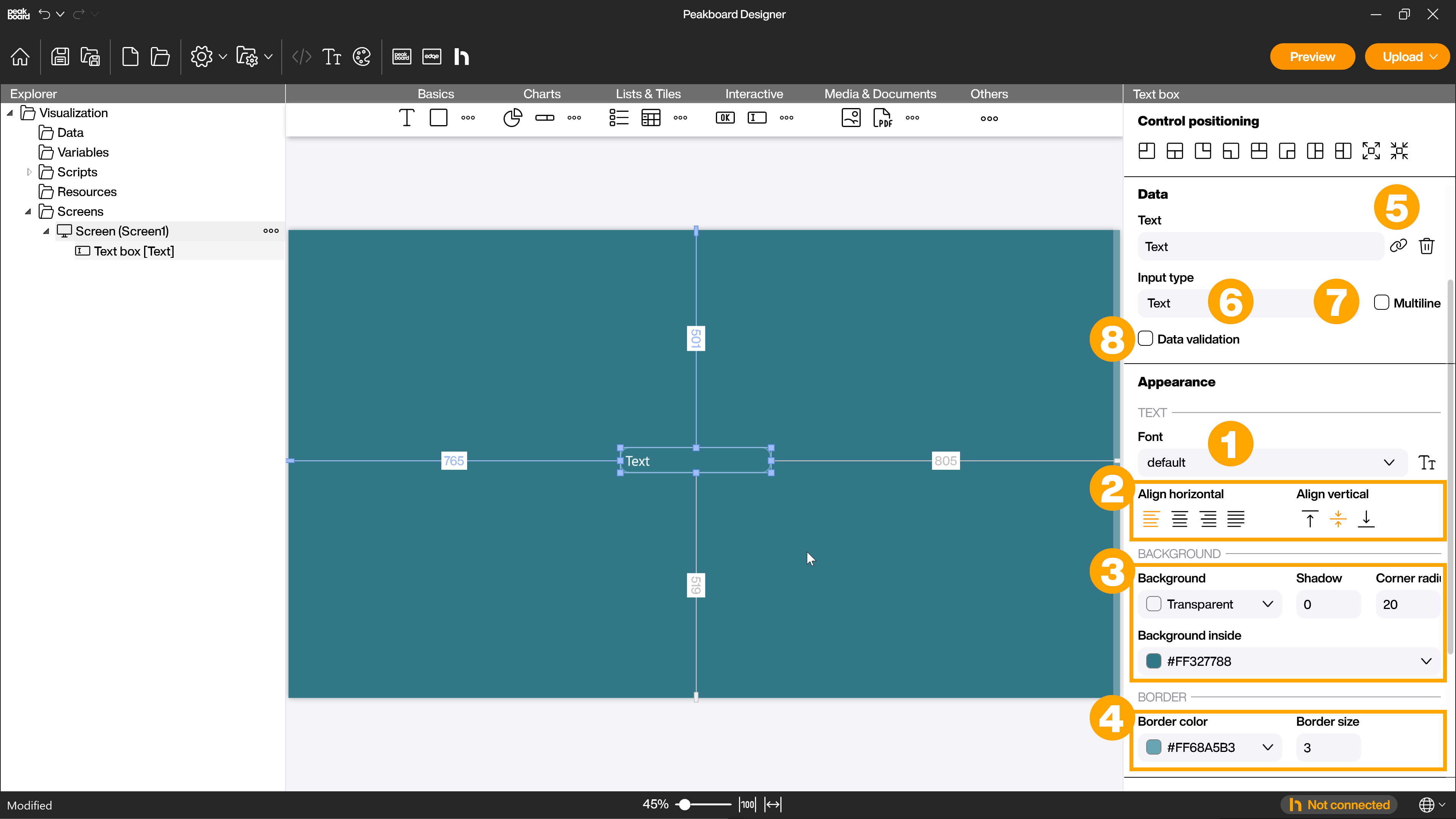
In addition to the [Appearance] area in the attributes, where you can adjust properties such as font (1), alignment (2) background (3) and border properties (4), you will find text box-specific properties in the [Data] area for the text box. You can link the text field to a data source by clicking on the link icon (5). You can also select an input type (6) from the drop-down menu. Choose [Text] for normal text input. You can specify if multiline (7) should be possible and you can activate the data validation (8) by clicking on the corresponding checkbox.
Data validation
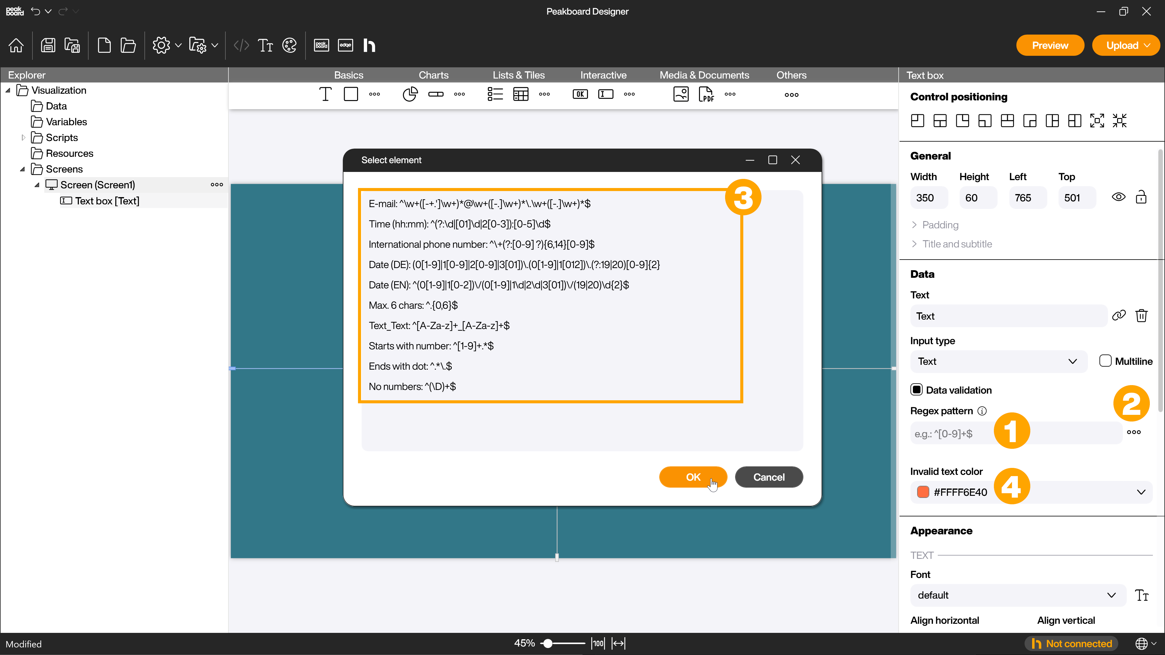
To validate the data entered into the text box you can use regular expressions (1). By clicking on the […] button (2) you will get to some sample expressions (3) that you can use, for example, if you want to enter a valid e-mail address in the field. You can find many sources for further and arbitrarily complex regular expressions on the Internet. To let the user of the text field see if his input is correct, you can specify a color for invalid input (4).
Other input types you can choose are [Password] and [Numeric]. If you choose the input type [Password], the entered text will be replaced by [*] in the visualization. You can also use the data validation here. If you select the [Numeric] input type, data validation is automatically activated and the input is limited to natural numbers by a regex.
Processing input
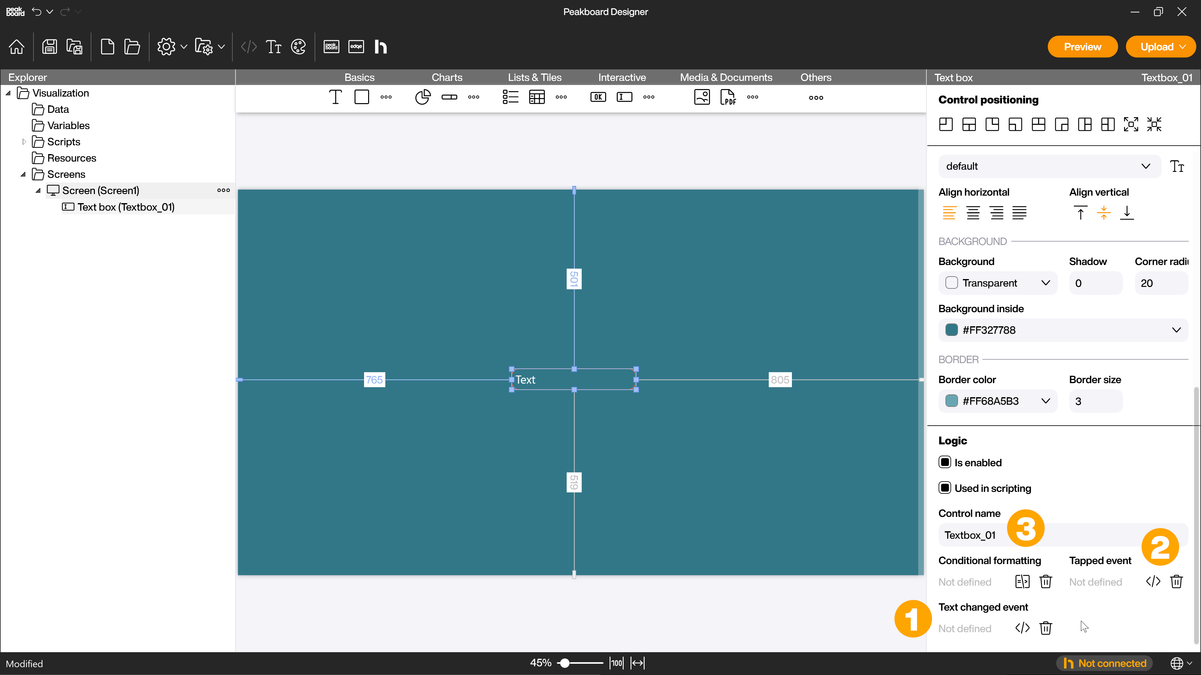
You can process the input in different ways. In the [Logic] section of the attributes, you will find two different script options for this:
- [Text changed event] (1) - here you can define a script that will be executed when a new input is made.
- [Tapped event] (2) - here you can specify a script that will be executed when the text field is tapped or clicked with the mouse.
More information on how to create scripts or how the Script editor works can be found in the scripting section. If the control is used in scripts you can activate the corresponding checkbox and give the control a name (3) to be used in the scripts.