Controls
General Properties
All controls have properties. These include special properties that only apply to the respective control, but also general properties that occur with almost every control or at least with many controls. To avoid having to explain all properties again and again on every help page, the properties that appear on more than one control are summarized in the following article. The properties area is divided into several sections.
Control positioning
You can use the positioning tools to automatically scale the controls and fill a specific area.
| Property | Description |
|---|---|
| Fill top left | Fills the top left area of the workspace with the control. |
| Fill top | Fills the top half of the workspace with the control. |
| Fill top right | Fills the top right area of the workspace with the control. |
| Fill bottom left | Fills the bottom left area of the workspace with the control. |
| Fill bottom | Fills the bottom half of the workspace with the control. |
| Fill bottom right | Fills the bottom right area of the workspace with the control. |
| Fill left | Fills the left half of the workspace with the control. |
| Fill right | Fills the right half of the workspace with the control. |
| Fill screen | Fills the entire workspace with the control. |
| Center control | Centers the selected control in the workspace. |
Tip:
If the Shift key is held down, a margin is automatically added on all sides.
Converting a control
Related controls can be turned into each other without rebuilding them. Right-click the control and choose the corresponding entry from the context menu. The data binding and the properties that both controls share are carried over.
| Control | Can be converted into | Notes |
|---|---|---|
| Linear gauge | Circular gauge | Conditional formatting is kept, the size is not |
| Circular gauge | Linear gauge | Conditional formatting is kept, the size is not |
| Styled list | Styled tile collection | Size is kept, only available on a screen |
| Styled tile collection | Styled list | Size is kept, only available on a screen |
| Checkbox | Toggle switch | Size is kept, conditional formatting is not carried over |
| Toggle switch | Checkbox | Size is kept, conditional formatting is not carried over |
The conversion between styled list and styled tile collection is not offered inside a styled list or tile template — only for a control placed directly on a screen.
Stacking order (Z-index)
When controls overlap, the Z-index decides which one is drawn on top. Besides the hotkeys for moving a control forward or backward one step at a time, there is a slider for it.
Select a single control or a single group and hold down the Alt key. A vertical slider appears centered over the selected element. Drag the handle to move the element through the stacking order and release the mouse button to apply the new position. Releasing the Alt key hides the slider again.
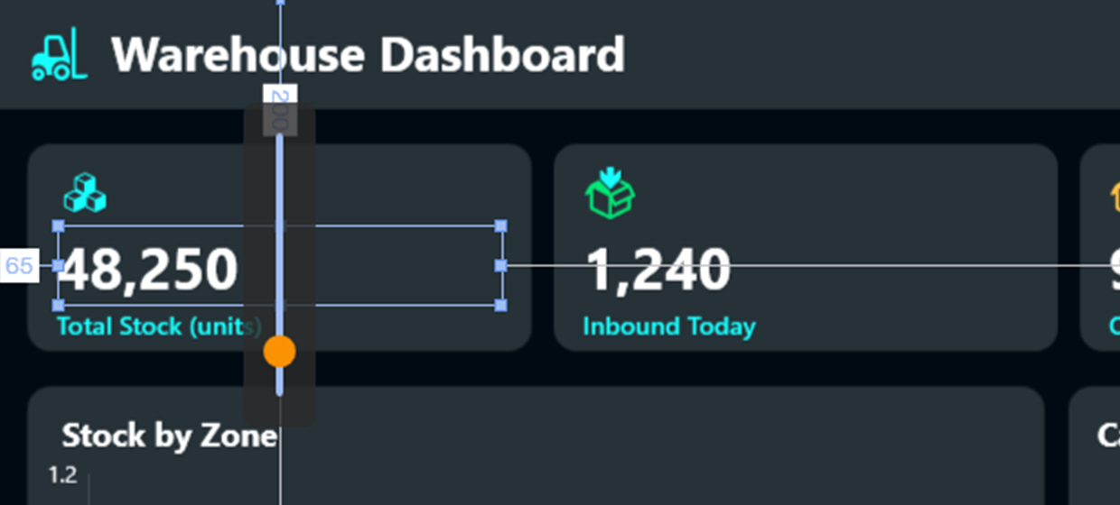
Two things are worth knowing:
- The slider only reorders within the parent group. A control inside a group can therefore never be pushed in front of or behind an element outside of that group.
- The whole drag counts as a single step for the undo function, no matter how many positions you move the element.
The slider only appears when there is actually something to reorder — that is, when the parent group contains more than one element.
Control layout
If several controls are selected at the same time, the alignment options for the selected controls appear. The other properties cannot be defined across all controls and are therefore hidden.
| Property | Description |
|---|---|
| Align left | Aligns the selected controls to the left edge of the control that is furthest to the left on the workspace. |
| Align centered | Aligns the selected controls to their common vertical axis. |
| Align right | Aligns the selected controls to the right edge of the control that is furthest to the right on the workspace. |
| Align top | Aligns the selected controls to the top edge of the control that is furthest up on the workspace. |
| Align center | Aligns the selected controls to their common horizontal axis. |
| Align bottom | Aligns the selected controls to the bottom edge of the control that is furthest down on the workspace. |
| Make horizontal spacing equal | If more than two controls are selected, you can use this property to make the horizontal spacing between the controls the same size. |
| Make vertical spacing equal | If more than two controls are selected, you can use this property to make the vertical spacing between the controls the same size. |
| Remove horizontal spacing | If more than two controls are selected, you can use this property to remove the horizontal spacing between the controls. |
| Remove vertical spacing | If more than two controls are selected, you can use this property to remove the vertical spacing between the controls. |
General
In this section you will find properties that most controls share.
| Property | Description |
|---|---|
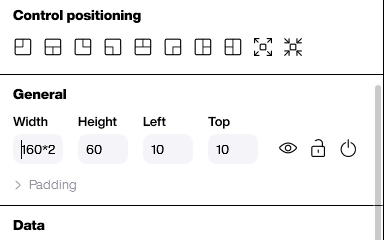
| Width | The width of the control in pixels. |
| Height | The height of the control in pixels. |
| Left | The distance of the control to the left edge of the workspace in pixels. |
| Top | The distance of the control to the top edge of the workspace in pixels. |
| Show/Hide control | Shows or hides the control on the workspace. |
| Fix/Unfix control | Locks the control to the workspace and thus disables the option to move the control or unlocks it. |
| Padding | Defines an inner spacing for the frame of the control in pixels. |
| Title and subtitle | Adds a title and/or subtitle to the control without having to use a separate text field. |
Calculating in the size and position fields
Width, Height, Left and Top — and the four fields below Padding — accept a calculation instead of a plain number. Type 160*2 into Width, press Enter, and the field reads 320. That saves reaching for a calculator whenever a control has to be twice as wide, half as high or 40 pixels further to the right.
| Input | Result | Operation |
|---|---|---|
300+50 |
350 | Addition |
350-100 |
250 | Subtraction |
160*2 |
320 | Multiplication — with the asterisk |
500/4 |
125 | Division |
(100+50)*2 |
300 | Parentheses, with the usual precedence |
The calculation is carried out when you press Enter or when you leave the field, never while you are still typing. The arrow keys still raise and lower the value by one pixel at a time.
Note:
- The result is always rounded to a whole pixel.
125/2therefore becomes 62, not 62.5. - The letter x is not a multiplication sign. It is dropped from the input, so
250x2does not give 500 but 2502 — always use*. - A result below zero becomes 0.
100-300in the Left field gives 0, not -200. - If the calculation cannot be resolved — an operator without a second number, such as
320+— the field is set to 0 and the previous value is gone. Undo does not bring it back, so check the value after entering a calculation.
Data
The binding popup has buttons to copy a data binding and paste it onto another property. That saves clicking through the data source, the column and the row again when several properties of a board should read from the same place. Copy is only available once a data source is actually selected.
The font selection is a searchable dropdown: start typing and the list filters down, which is considerably faster than scrolling once a project has a lot of fonts defined.
This area is not available for all controls and can vary significantly between the different controls. In most cases, values can be manually entered here or data sources can be linked to the control.
Appearance
In this area, you can use various properties to influence the appearance of the control. The available properties differ depending on the selected control. Background colors, outlines, shadows, fonts and many other properties can often be adjusted.
Gradients: wherever a background color can be set, you can also choose a gradient instead of a solid color — including for the Button control. Each colour stop of a gradient has its own opacity, so you can let a control fade out towards one edge instead of ending abruptly.
The Drawing area is the exception: its background is always a solid color.
Logic
In this area, you will find properties that have to do with logic. In addition to pure scripting, you will also find properties for low-code and no-code areas such as conditional formatting.
| Property | Description |
|---|---|
| Is activated | Activates or deactivates the control in the application. You can control and change this property using a script. |
| Used in scripts | If you activate this property, further properties such as the control name are available. This is required so that the control can be addressed in scripts. |
| Control name | A unique name for the control (without special characters) to access it from scripts. You only need to assign a name if the control is actually used from scripts. |
| Conditional formatting | The conditional formatting allows you to change different properties of a control based on a defined event without having to resort to complex scripts. |
| Events | These properties can be used to call up the script editor, which contains one or more scripts that are called up when events occur for the selected control. |