Data sources
External dynamic data sources illustrated by an XML data source example
Basically, Peakboard distinguishes between two main concepts of how dynamic content is embedded:
-
The data comes fully prepared from the external source and only needs to be integrated into a panel. This is the case, for example, if you embed an external website in part or in full. Or if you use a BI tool such as Power BI, Tableau or similar and leave the preparation of the data to that tool. Peakboard then acts as a kind of display program while the respective pre-system takes care of the visual preparation.
-
The data comes in as raw data from an external source. Such sources can be, for example, XML, JSON, a database or a social media feed. Here only the pure data is transported and the visualization happens directly in Peakboard. For this purpose visual controls are available to display the data nicely, e.g. charts, tables, etc.
This guide deals exclusively with the second option. The basis is an XML data source. As a public example we use a small CD catalog provided by W3Schools – feel free to open it in your browser to see its structure:
https://www.w3schools.com/xml/cd_catalog.xml
Add the XML data source
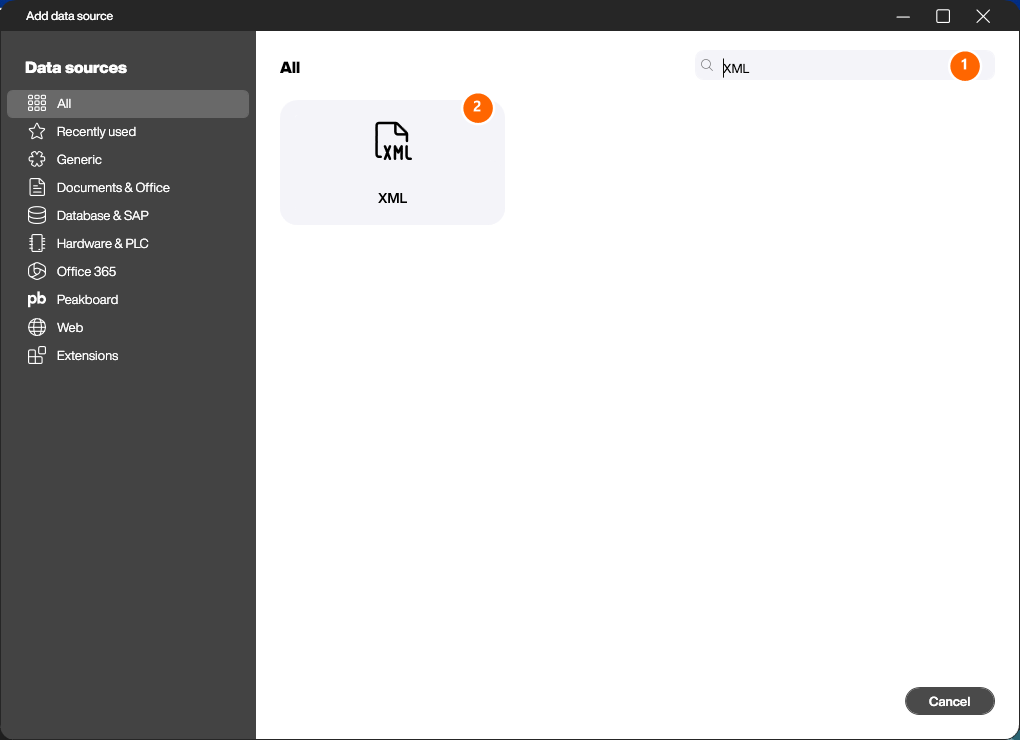
Open the Peakboard Designer. In the explorer, click the […] button next to [Data] (or right-click [Data] and choose [Add data source]). In the [Add data source] dialog, type “XML” into the search field (1) so the list is filtered down to the XML tile (2). Open it with a double click.
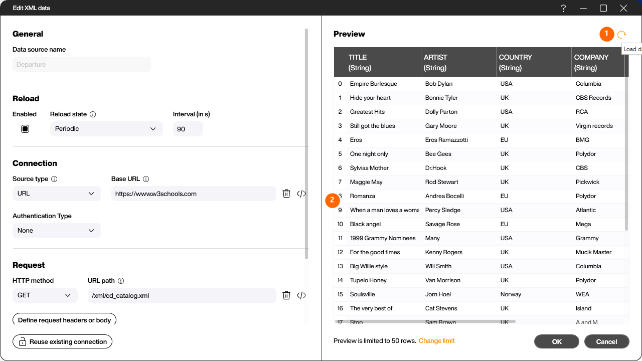
Configure the connection
The configuration dialog opens. On the left you define where the data comes from, on the right you get a live preview.
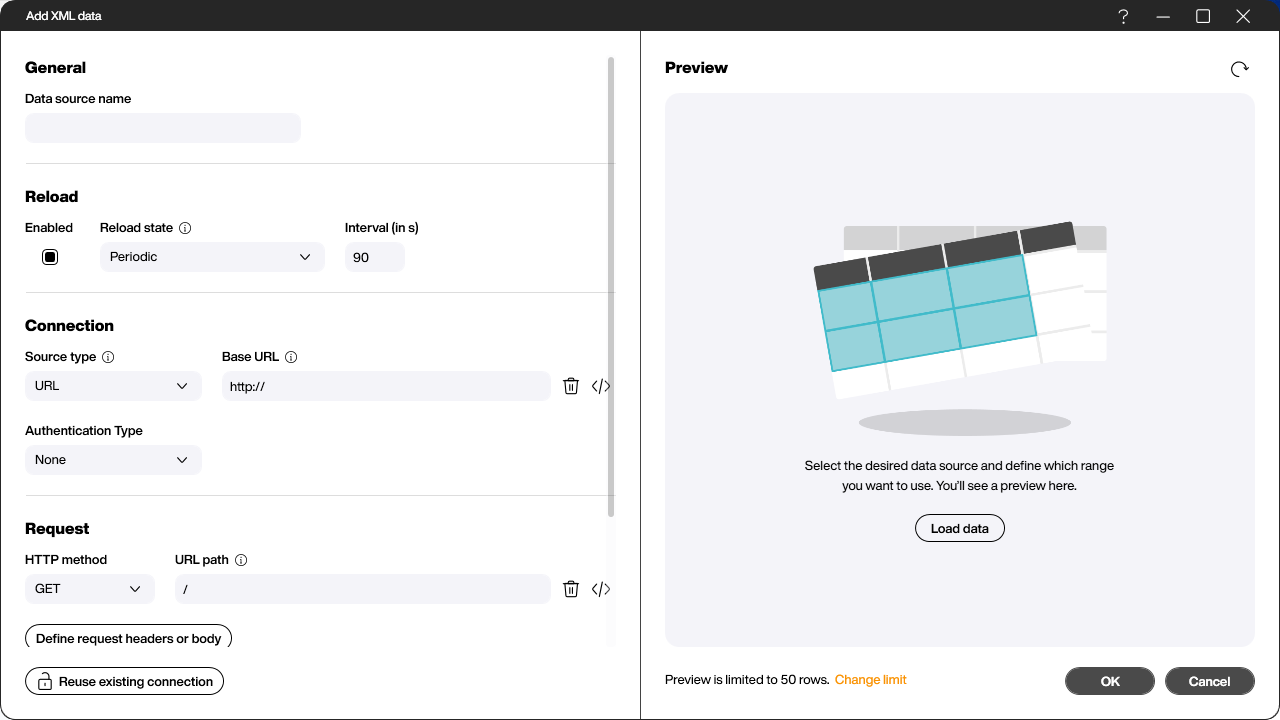
Fill in the fields:
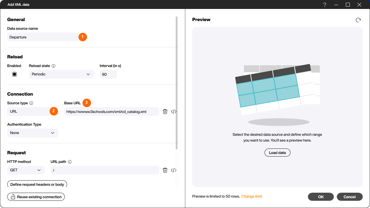
- Data source name (1) – assign a unique, descriptive name (e.g.
Departure). - Source type (2) – where the XML source is located: via URL, in a network share, as a local file, in Microsoft 365 or in the Peakboard Hub. For this example, leave it on URL.
- Base URL (3) – paste the CD catalog address from above. Peakboard automatically splits it into the base URL and the URL path. If the source is protected you can additionally set an Authentication Type.
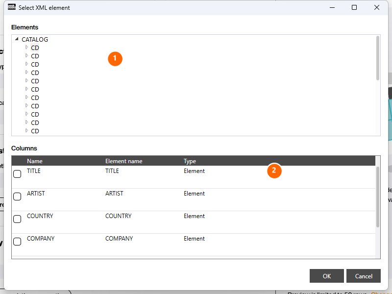
Select the XML element
Because a Peakboard data source is always tabular, you have to define which part of the XML tree forms the table. Click the […] button in the [Specify details] area. Peakboard downloads the source and analyzes its structure.
In the [Elements] tree (1) pick the element that repeats and therefore forms the table rows – in the example the CD node below CATALOG. The resulting [Columns] (2) appear below. Tick only the columns you actually need; especially with very complex XML files it is good practice to leave out unused elements right from the start. Confirm with [OK].
Load the preview
Back in the configuration dialog, click [Load data]. The reload icon (1) refreshes the preview at any time. In the [Preview] area (2) you can check the plausibility of the data and the detected data types. Click [OK] to create the data source. It now appears in the explorer under [Data] and can be bound to any control.
Visualize the data in a table
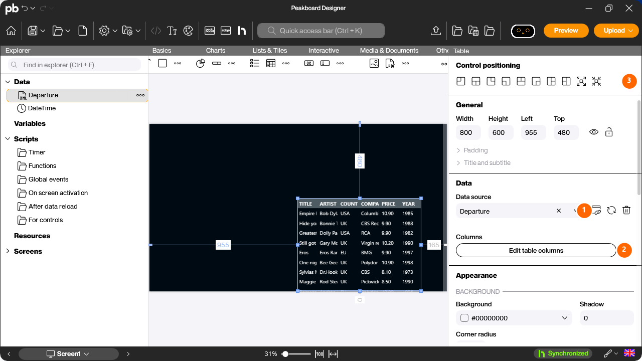
Next you create the visualization. The data should simply be shown in a table. Drag the data source from the explorer onto the workspace and choose [Table] from the menu that appears. The table is created and is already bound to the data source (1) – it immediately shows all columns with live data.
To turn the table into a finished dashboard, use [Edit table columns] (2) to refine the columns and the [Control positioning] icons (3) to place and size the control. The fastest way to fill the screen is the Fill screen icon.
Customize the columns
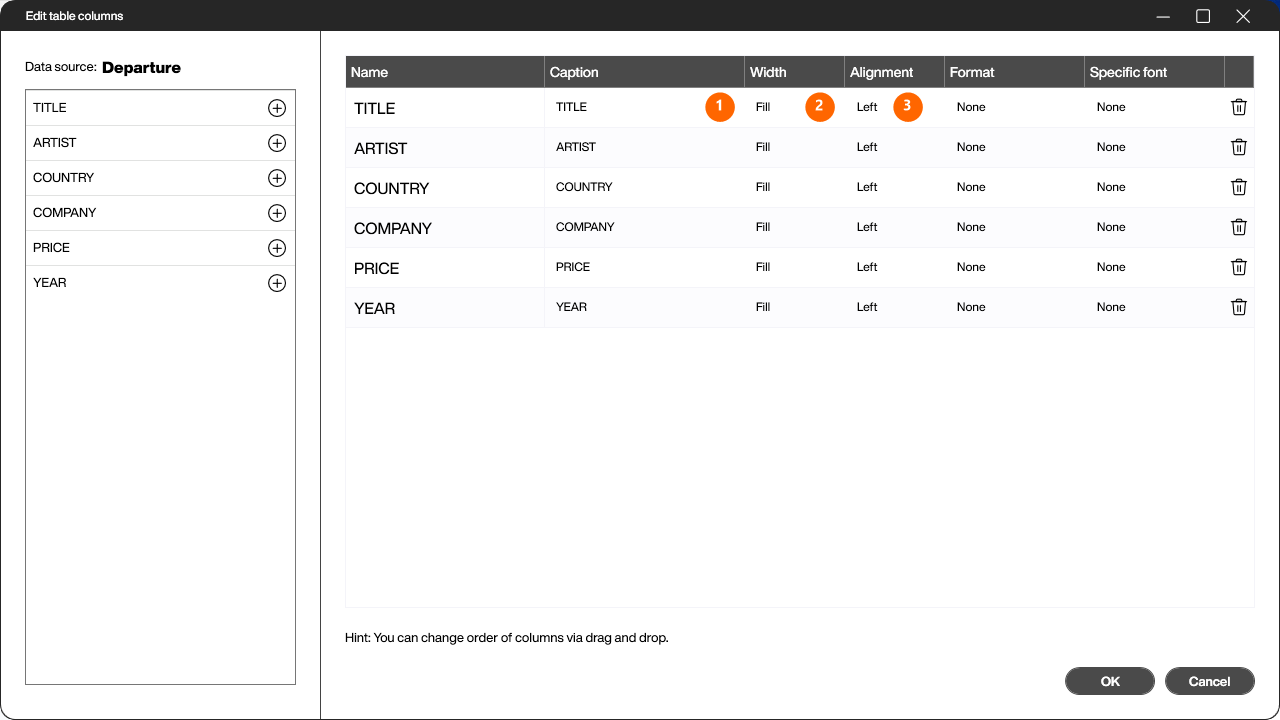
Click [Edit table columns] to open the column dialog. Every column of the data source is listed there:
- Caption (1) – give the columns better, readable names, e.g. “Album” instead of
TITLE. - Width (2) – “Fill” stretches a column; switch most columns to “Cut” so they only take up as much space as their widest value needs.
- Alignment (3) – set the horizontal alignment, e.g. “Center” for short values.
You can also adjust [Format] and [Specific font] per column, and reorder columns via drag and drop. Confirm with [OK].
Back on the workspace you can fine-tune the look of the table in the [Appearance] section (header and body font, background color, border, cell padding, …). When everything fits, click [Preview] to run the application: the table is filled dynamically and refreshed automatically according to the reload interval of the data source.