Controls
Linear and circular gauges
You can use the linear and circular gauge to show progress, utilization or similar states.
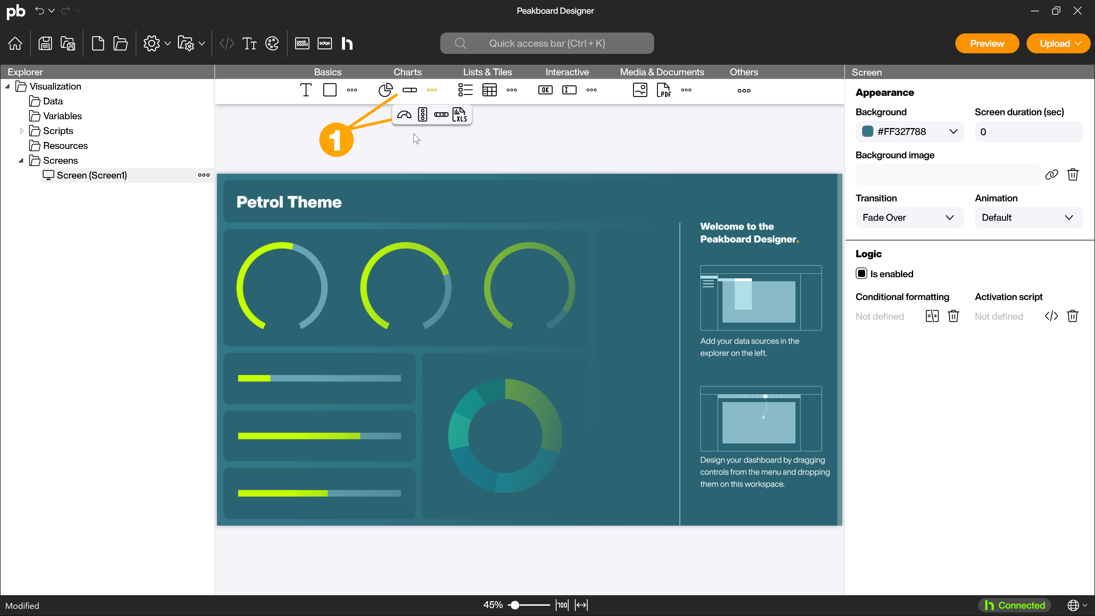
Adding a gauge
To add one of the gauges to your application, drag and drop the control (1) onto the workspace. The dialog for configuring the control opens automatically.
Configure gauge
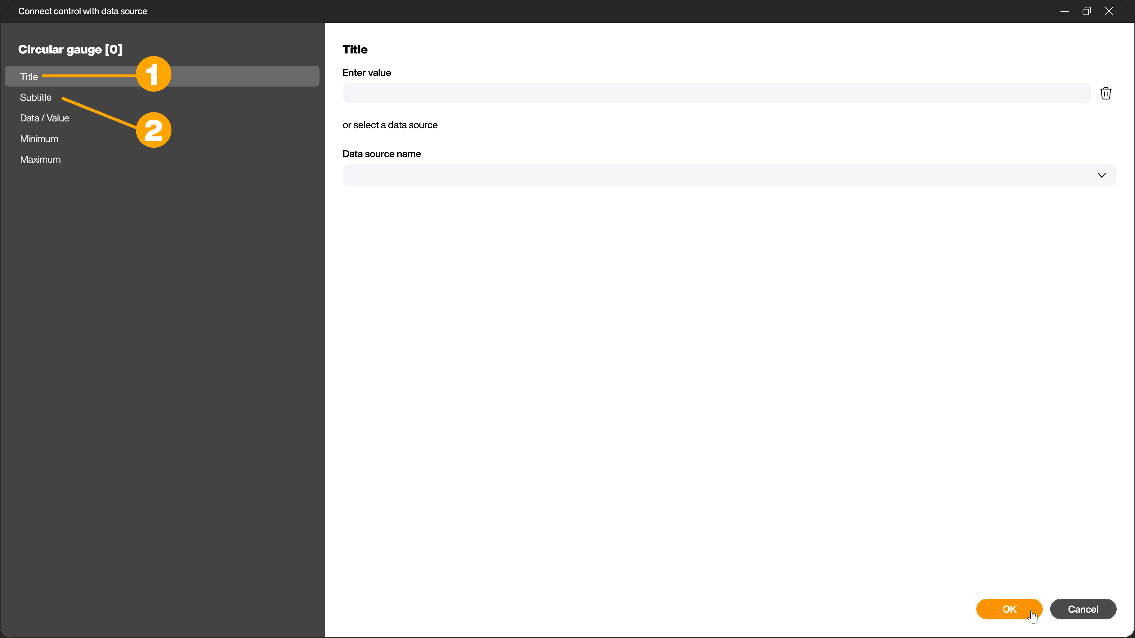
You can make the first basic settings in the open dialog of the control. In the left area of the dialog (1) you will find the available tabs. You can make the corresponding settings on the right (2). The Data/Value tab is opened automatically.
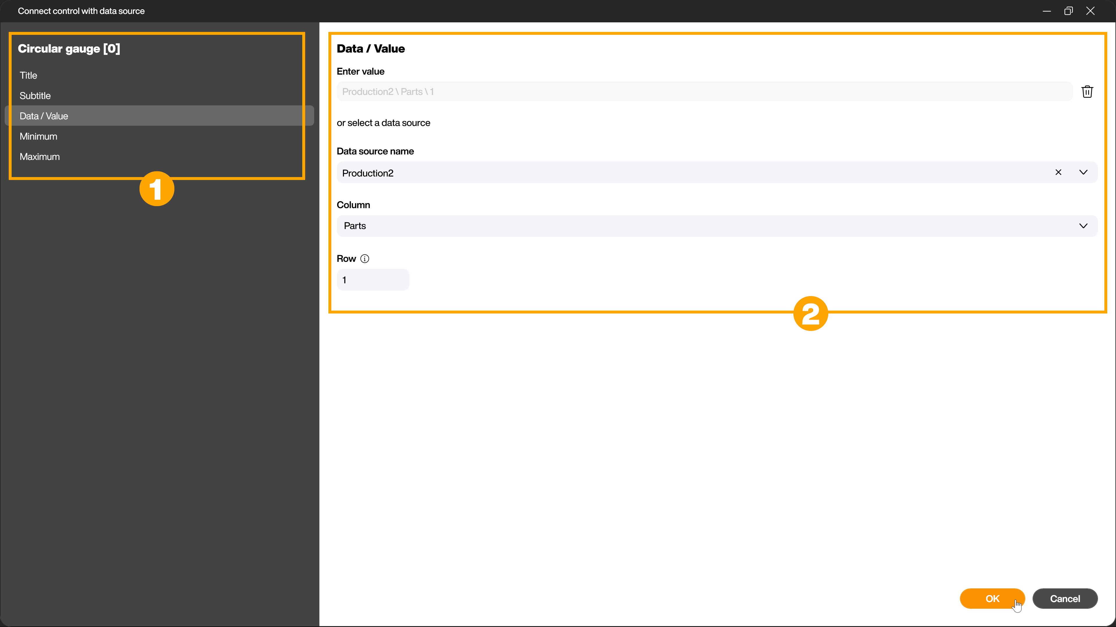
Connect data source with control
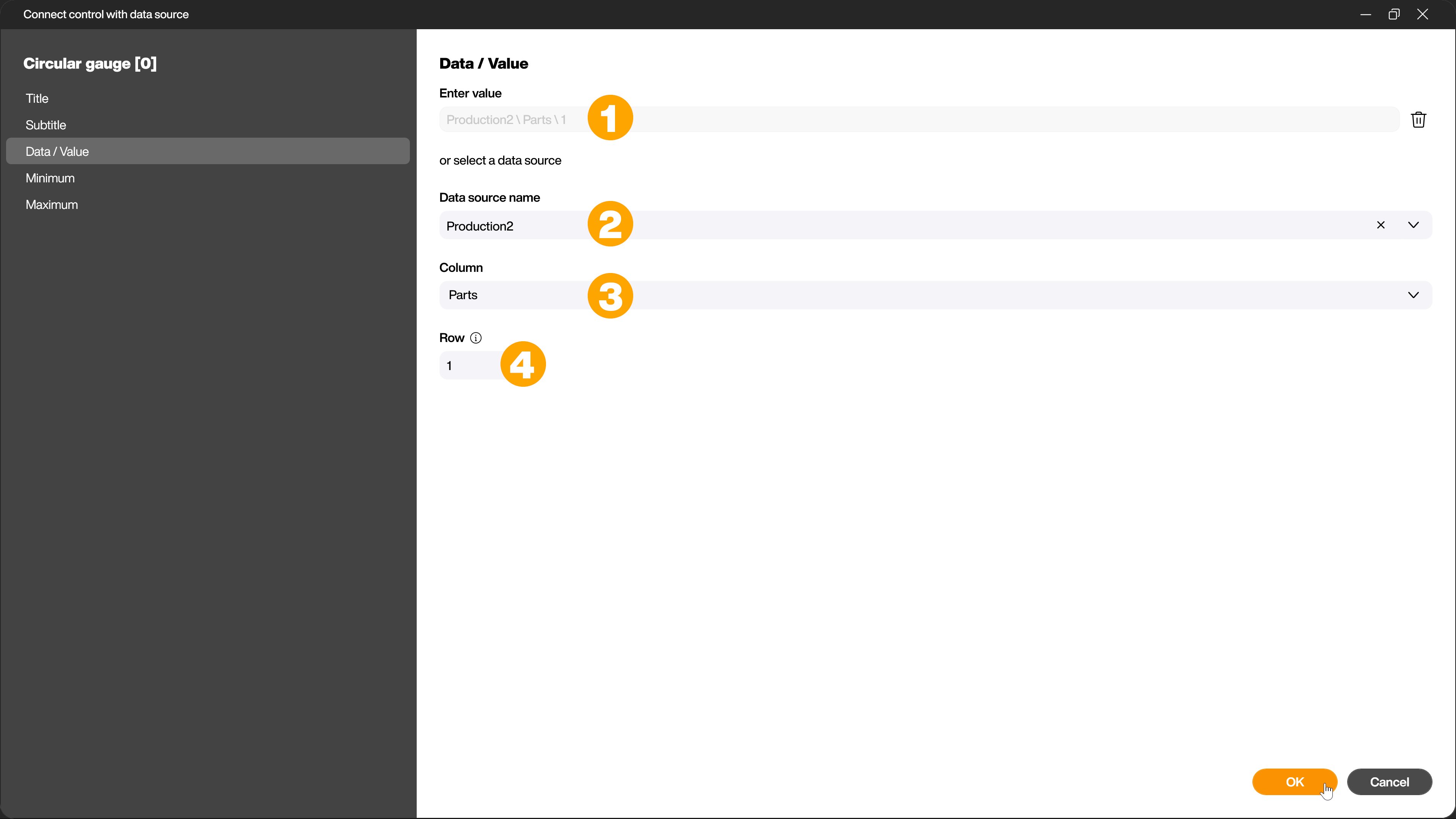
In the Data/Value tab, you can enter a value manually (1) or link a data source with data of the Number data type to the control. This value is then displayed live. To link the data source, select it from the [Name of data source] (2) drop-down menu. If it is a tabular data source, select the desired column (3) and row (4).
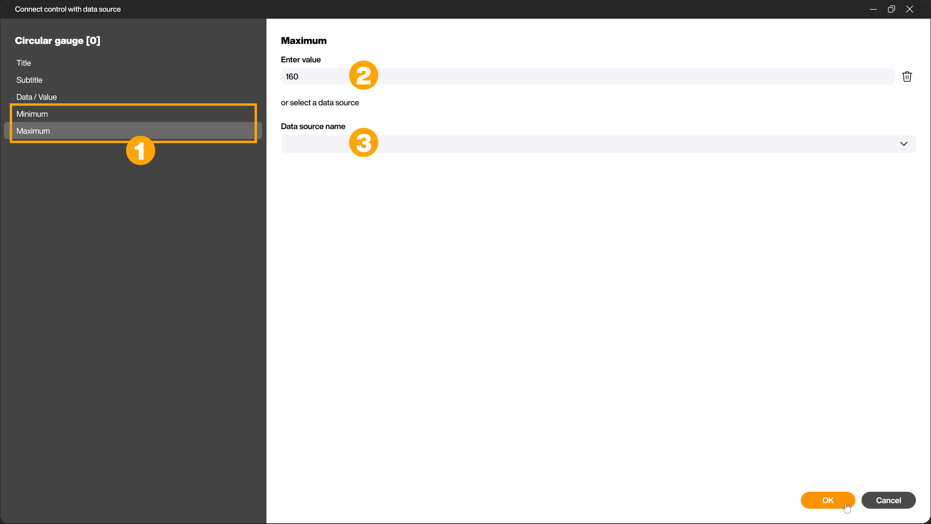
Define minimum and/or maximum
In order to display progress or utilization, the control requires a minimum and maximum value. By default, the value [0] is defined for the minimum, the value [100] for the maximum. You can either change both values manually (2) via the respective tab (1) or connect a data source (3). For example, you can link the target value of a production system as a variable for the maximum and the actual value of the machine as the current value to display the daily progress.
Assign titles and subtitles
In the [Title] (1) and [Subtitle] (2) tabs, you can give the control a title and subtitle either manually or by linking a data source.
Customize the appearance of the control in the attributes
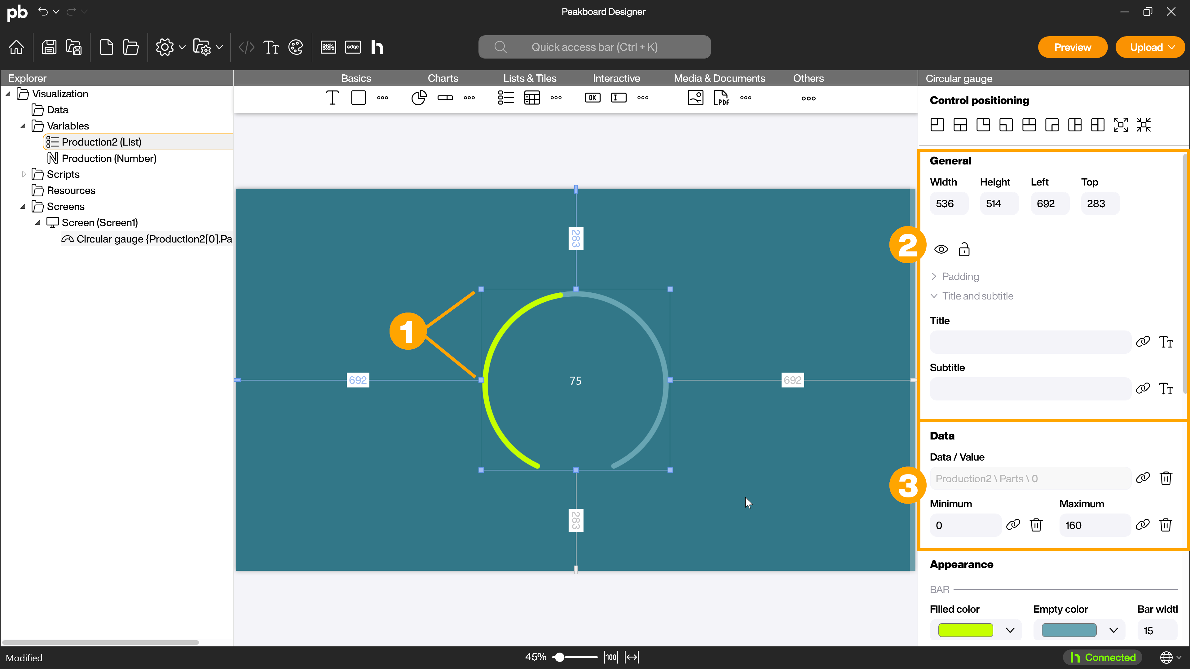
To adjust the appearance of your gauge, exit the configuration dialog. You can adjust the size of the control by dragging the corners or sides (1) of the control or in the attributes in the [General] section (2). There you can also define spacing for the control and adjust the title and subtitle previously assigned in the dialog. Alternatively, you can double-click on the control to reopen the dialog.
In the [Data] section (3), you can adjust the settings previously made in the dialog for [Data/Value] as well as the minimum and maximum.
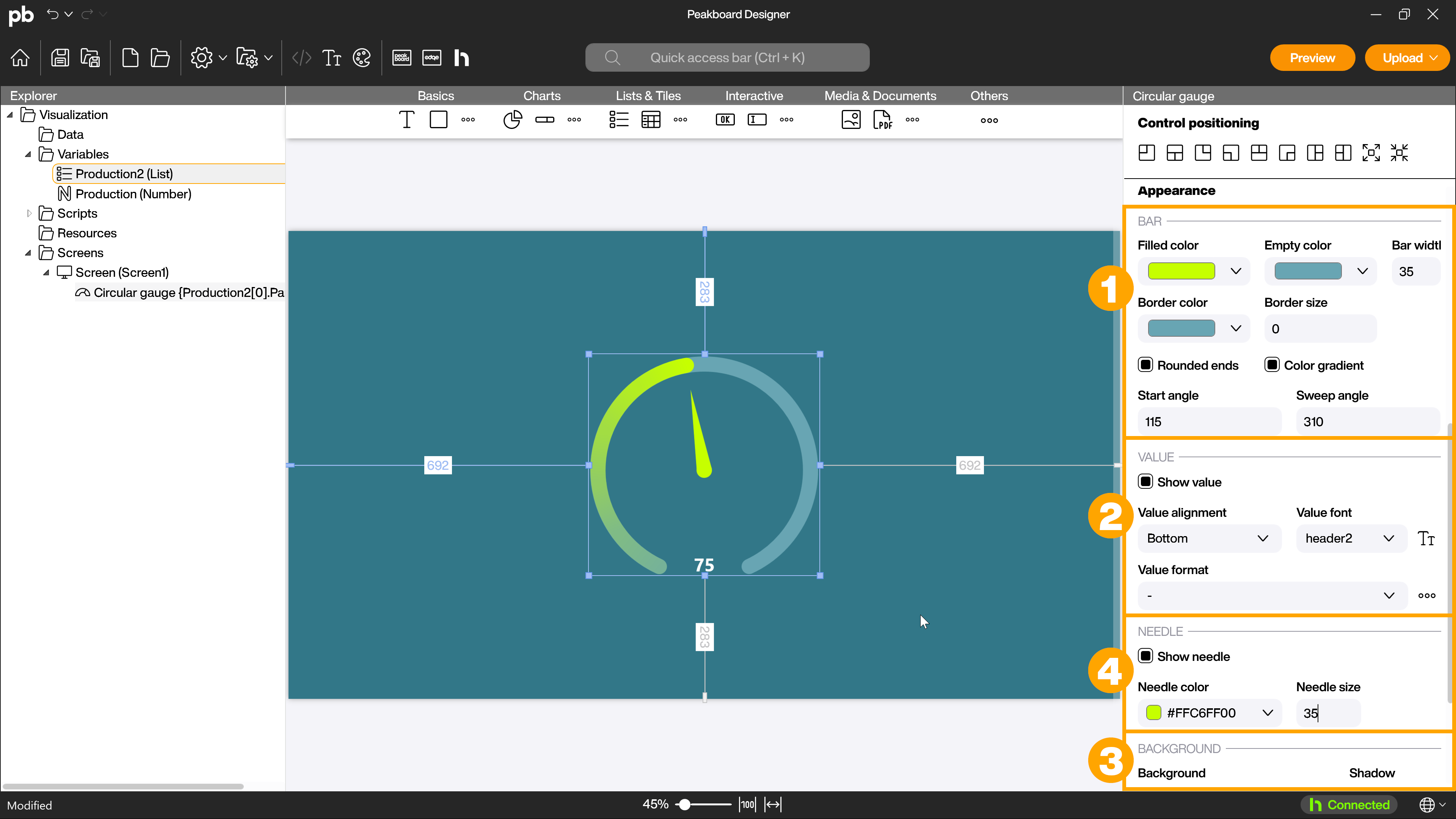
In the [Appearance] section, you can then adjust the other visual aspects, such as the appearance of the bar (1). In addition to the bar width and the colors used, you can specify whether the colors should be displayed as a gradient. If the checkbox is activated, a gradient is automatically created between transparent and the selected color. For the circular gauge, you can use the [Rounded ends] checkbox to specify whether the corners of the bar should be straight or rounded. Use the start angle to specify where the gauge should begin and the sweep angle to specify how many degrees of the circle the gauge should cover. You can specify whether and how the value should be displayed (2) and how the background of the control (3) should be designed. You can also insert a pointer into the circular gauge and define its appearance (4).
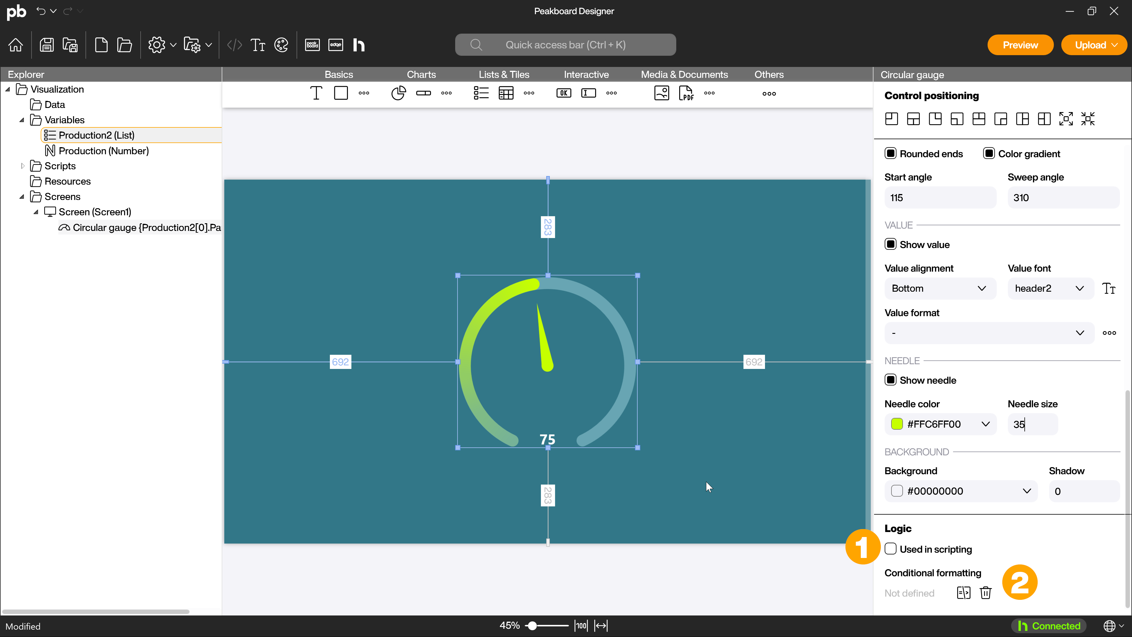
In the Logic area, you can make the control available for scripts (1) and use conditional formatting (2) to adjust the properties of the control based on rules, for example to implement changes to the appearance when threshold values are reached.