Controls
Components
A component groups several controls into a single reusable unit. Once a component has been created, it shows up like any other control in the control area and can be dropped onto one or several screens. A change to the component itself (the master) is automatically reflected in every instance. Components are therefore ideal whenever the same layout appears in more than one place – typical examples are header bars, navigation bars, footers, KPI tiles, or status panels.
Create a component
First arrange the controls on the canvas that should make up your component and align them the way you want. Then select all of them (for example via lasso, with Ctrl + A, or by clicking with the Shift key held). Right-click anywhere on the canvas to open the context menu and choose [Create component] – the keyboard shortcut Ctrl + Q does the same thing.
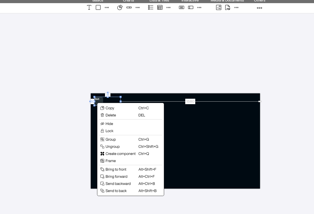
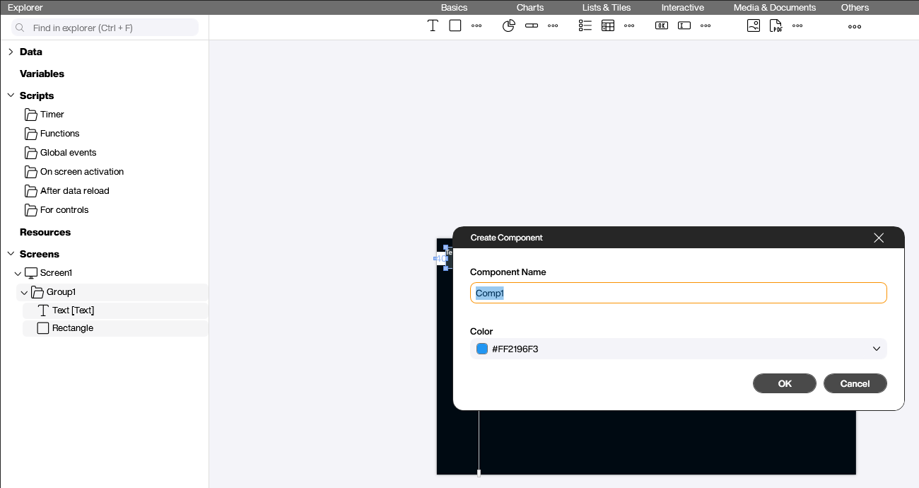
In the dialog that opens, give the component a meaningful name (for example HeaderBar) and optionally choose a color. The color is used solely for the icon in the control area and in the Explorer; it helps you tell several components apart at a glance. Confirm with [OK].
Master and instance
Confirming the dialog triggers several things at once:
- The selected controls stay on the screen as the master – from now on they act as the template for every further use.
- A new [Components] section appears in the Explorer, holding your component (
HeaderBarin this example). - A [Components] category appears in the control area. From there the component can be dragged onto any screen, just like any other control. Each placement created this way is a slave instance that stays linked to the master.
![The [Components] category in the control area, here with a `ValueTile` component](/assets/images/Controls/Basics/components/components-03-control-area.png)
Every component has exactly one master and any number of slave instances. The master is just an ordinary placement on a screen – only that this one acts as the template. Changes to the master are picked up automatically by every slave instance. Changes made directly to a slave instance only affect that single slave; the master and the other slaves stay untouched.
Editing a component
Rename the master or change the color
Right-click the entry in the Explorer’s [Components] section to open the component’s context menu.
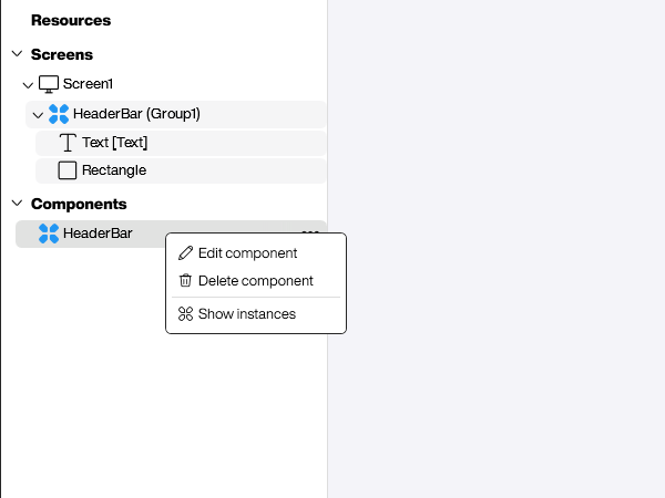
- [Edit component] opens the dialog with name and color.
- [Delete component] removes the component. Existing slave instances lose their link to it.
- [Show instances] highlights every place where the component is used, both in the Explorer and on the screens – very handy for keeping an overview in larger projects.
Change the master’s content
The content of the component is edited directly on the master on the canvas: expand the master in the Explorer and edit the controls inside it – change text, adjust colors, add or remove controls. Every slave instance picks up the change automatically as soon as it is saved. No extra step is required.
Local changes on a slave instance
You can also let a single slave instance deviate locally without affecting the master or any other instance – for example, set a different title on the header bar of one specific screen. Simply edit the controls inside that slave instance on the screen. The other slaves and the master stay unchanged.
A property that you have changed locally is no longer overwritten by the master afterwards: even if you later adjust the same value on the master, the local override on the slave instance is preserved. All other properties that you have not changed locally continue to sync from the master automatically.
Sync with the master
The context menu of a slave instance offers three actions that govern its relationship with the master.
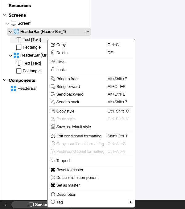
- [Reset to master] discards all local modifications of the slave instance – the instance matches the master exactly again.
- [Detach from component] breaks the link to the master completely. The instance is converted into a regular group and lives independently from then on.
- [Set as master] promotes a slave instance to become the new master. The previous master is demoted to a slave. Useful when one specific placement has the better setup and should become the template for everything else.
Practical examples
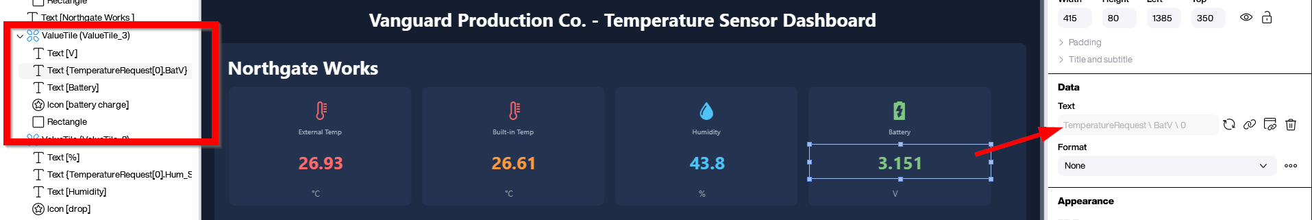
KPI tiles with per-instance values
A classic case for a component is a recurring KPI tile. Build the tile once from its parts – an [Icon], a caption, the value, a unit, and a background rectangle – and turn it into a component (here ValueTile). From then on you drop the component onto the screen as often as you need instead of copying the controls by hand.
Every instance keeps the same layout, but you can override individual properties locally: a different icon and color for External Temp, Built-in Temp, Humidity, and Battery, plus a different bound value per tile. Everything you don’t touch – spacing, fonts, the card background – keeps syncing from the master, so a later design change reaches all tiles at once.
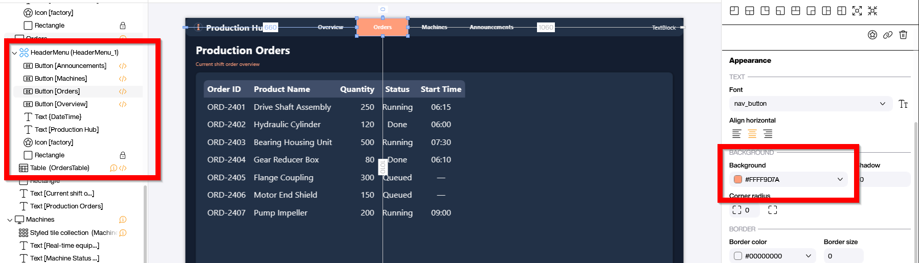
A shared header menu
A header or navigation menu is a perfect component, because it should look identical on every screen. Design the menu once on your overview screen – logo, title, and the navigation buttons – and convert the whole layout into a component (here HeaderMenu).
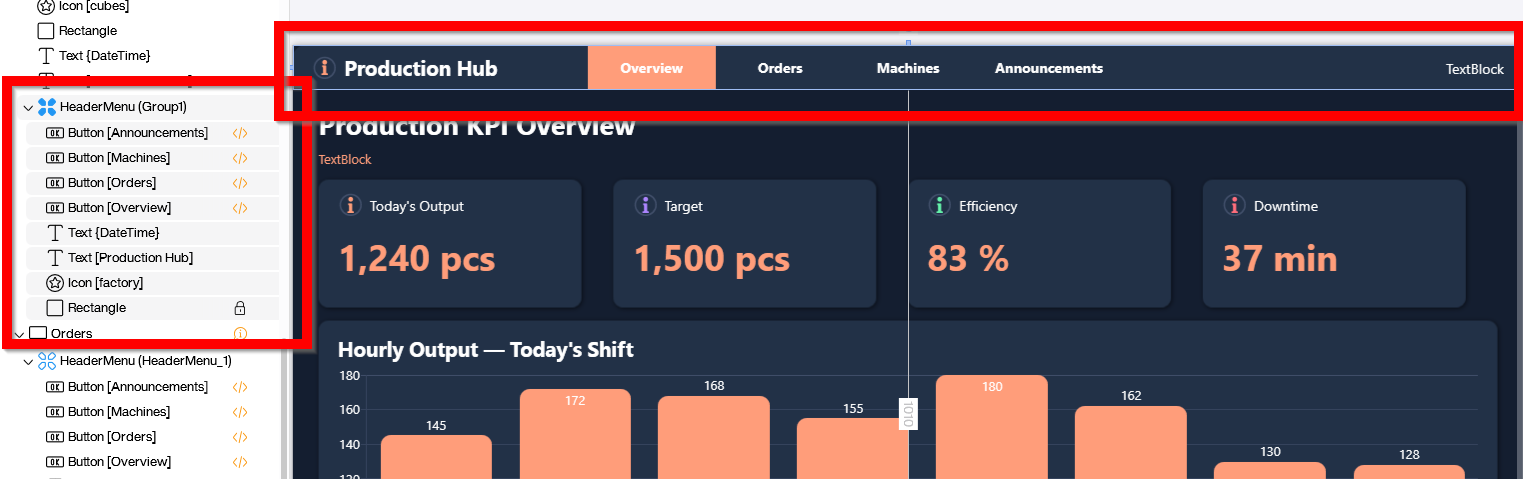
Now place the same component on every other screen. Layout, fonts, and the base colors all sync from the master. The only thing that differs per screen is the active-page indicator: on the Orders screen, for example, you override the background color of the [Orders] button to orange so users can see where they are. Because that color is a local override, a later change to the master leaves it untouched.
Typical use cases
- Header and footer bars that should look the same on every screen. A single change to the master updates every screen at once.
- Navigation bars with several buttons that switch screens via [Screen change].
- Recurring KPI tiles or status panels that need a consistent look.
- Branding elements such as logos combined with a clock that you want to reuse in every application.
If you simply want to move or align several controls together without needing the reusability of a master, the Group function (Ctrl + G) from the same context menu is the simpler choice.