Controls
Groups
A group combines several controls on a single screen into one unit. Unlike a component, there is no master and no cross-screen reusability – a group is purely an organisational helper for the current screen. Once controls are grouped, they can be moved, aligned, hidden, and conditionally formatted together.
Create a group
Select all the controls you want to group (for example via lasso, with Ctrl + A, or by clicking with the Shift key held). Right-click on the canvas to open the context menu and choose [Group]. The keyboard shortcut Ctrl + G does the same.
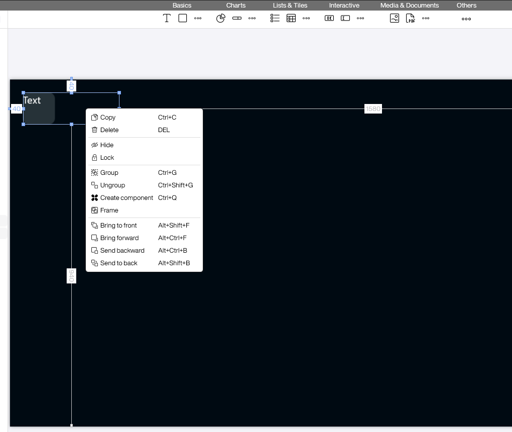
The same menu also offers [Ungroup] (Ctrl + Shift + G) to dissolve an existing group and [Create component] (Ctrl + Q) when the selection should become a reusable component instead of a simple group.
What happens after grouping
The selected controls are gathered in a new [Group1] folder underneath the screen node in the Explorer. On the canvas, all members share a common selection frame with resize handles.
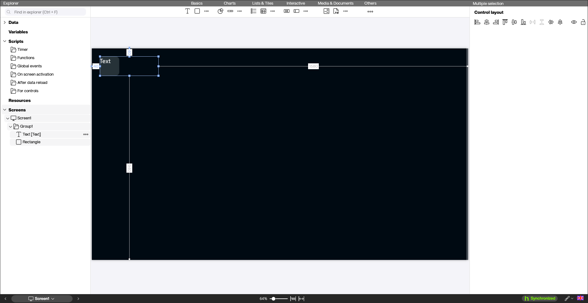
When the group is selected as a whole, the properties panel on the right shows [Multiple selection] with the [Control layout] section. These icons align members flush (left, center, right, top, middle, bottom), distribute them with equal spacing, or remove all gaps. The [Logic] section also exposes [Conditional formatting (Group1)]. This lets you hide the entire group at once whenever a variable reaches a certain value – which is the actual purpose of conditional formatting at the group level.
Individual controls inside the group remain fully editable. Click them in the Explorer or click them again on the canvas and change text, color, or size as usual.
Nesting and dissolving groups
Groups can be nested: if you select an existing group together with additional controls and press Ctrl + G, an outer group is created that contains the previous group as a member. [Ungroup] (Ctrl + Shift + G) always dissolves only the topmost level.
Dissolving a group does not delete the individual controls – they simply move back under the screen node in the Explorer. Any conditional formatting attached to the group folder is removed together with the group.
Typical use cases
- Show and hide dialogs: The classic use case for groups. You build a dialog (such as a confirmation box, a login form, or a detail view) from several controls on a screen, group them, and drive the visibility of the entire group via conditional formatting. As soon as a variable reaches the matching value, the whole dialog appears or disappears in one go.
- Align a layout block: Multiple texts, icons, and background shapes that form a single tile can be moved or scaled together to the right position.
- Tidy Explorer tree: On screens with many controls, groups keep the Explorer organised – similar to folders in a file system.