Controls
Styled Tile Collection
The Styled Tile Collection control is used to visually process records from a data source as tiles. To do this, you connect the control to a data source and create a custom template that is automatically extended with the provided data. Unlike the Styled Tile Control, it visualizes a selection of records rather than just a single row. The Collection Control is particularly suitable for dashboards where information such as specific status values, names, or key figures from an Excel list should be displayed in a custom-designed layout. You can find the Styled Tile Collection in the control menu bar of the Peakboard Designer in the Lists & Tiles group (1).

Configuration and Properties
1 General and Data Connection
The Styled Tile Collection control uses data from a data source, a data flow, or a variable list to display it visually. To do this, insert a data source in the Designer Explorer on the left side, such as an Excel list (1).
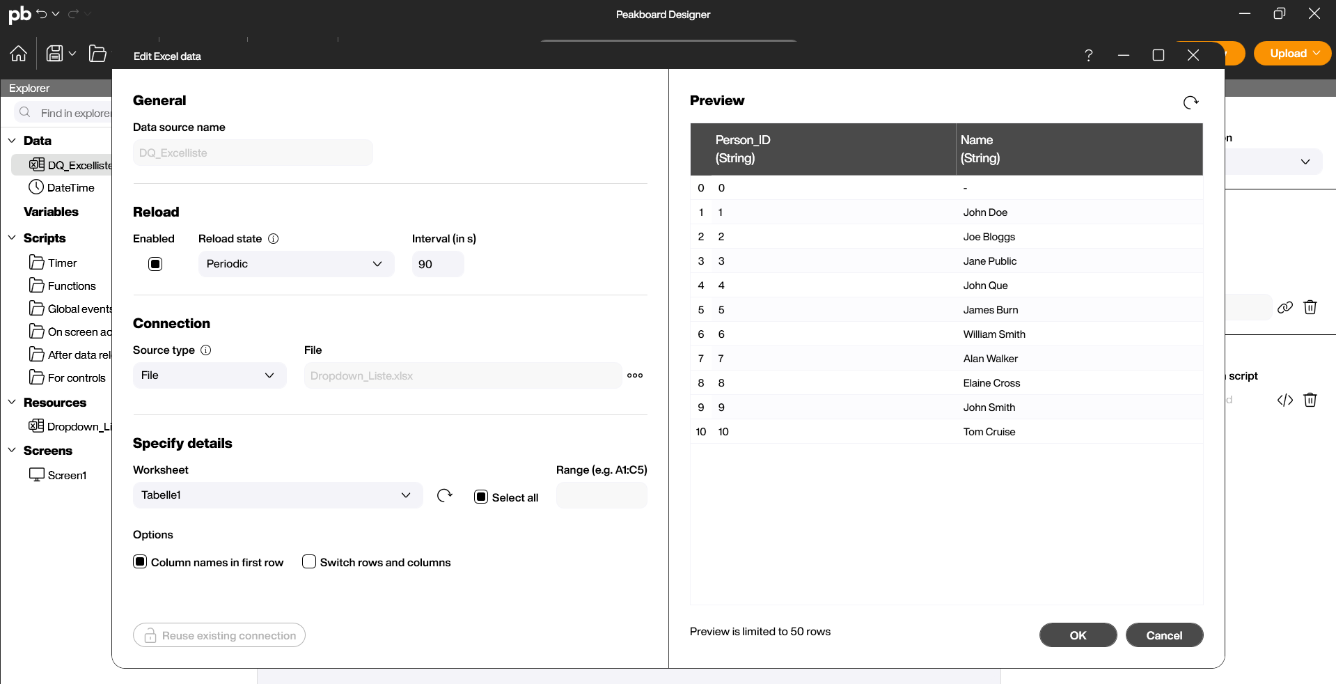
Drag and drop the control or place it on your workspace with a double-click. You can then link the data source you have already created in the Designer Explorer under “Data” to the control (1). Alternatively, you can drag the created data source directly onto the workspace and then select the control from the appearing menu.

1.1 Templates
- Under “Data” in the properties on the right side, the data connection can also be configured separately (1). As soon as the data source is linked, the control generates a separate tile for each existing record.
- Use the Template to define and edit the visual appearance of the tiles (2).
- The Conditional Templates function is described in more detail below (3).
- If the list is to be moved interactively, the Scrollbar checkbox can be activated to allow scrolling within the list.
- If a variable list is used for the data source, tiles can be moved within the same collection (“Within Styled List”) or between different collections (“With other Styled Lists”) (4). This function is disabled by default.

The editor for the template is similar to the functions on the main page but is limited to the workspace of a single tile within the collection. As with the main page functions, various controls (text, images, buttons) can be added to the template from the top menu bar (1). Under Data in the template, you can determine the source column and the display format of the records (2). The design defined here is automatically applied to the entire tile control. Finally, confirm the creation of the template by clicking OK (3).

Conditional Templates
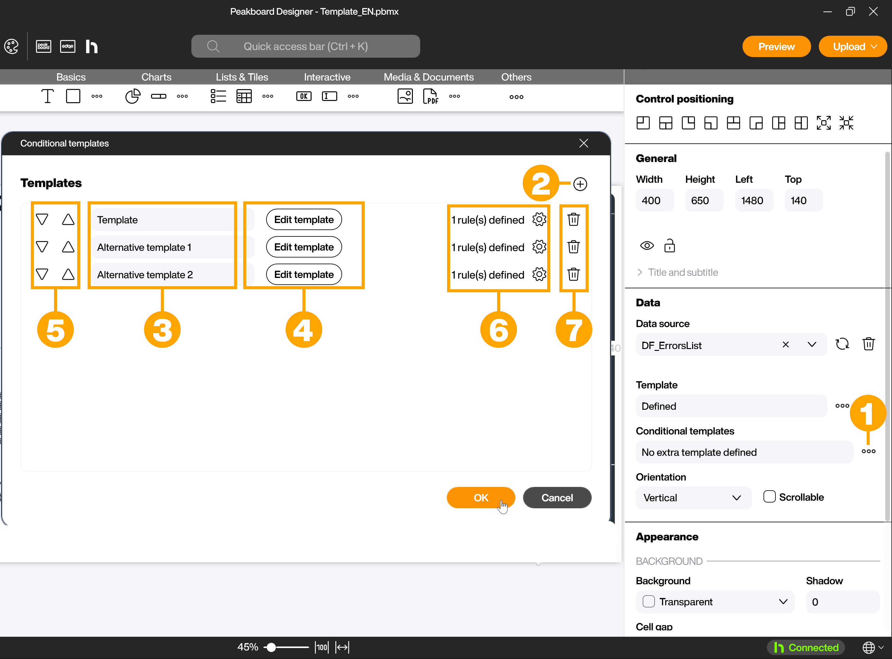
With the Styled Tile Collection control, it is possible—similar to conditional formatting—to use separate templates for representing rows based on defined rules. Click on the […] symbol (1) in the Conditional Templates section to open the dialog for conditional templates. Here you can add new templates (2). These automatically adopt the design of the standard template. You can rename the added templates (3), edit them (4), change their order (5), define rules for their display (6), or delete templates (7).
If the data should not be displayed as wrapping tiles but strictly row by row, use the Styled List control instead.