Controls
Table
The Table control is an interactive element that allows you to present structured data in a classic column and row view. It is the ideal tool for displaying inventory lists, production plans, or key figures from databases (SQL, SAP, Excel), where clarity and comparability are the main focus. You can find the Table control in the Peakboard Designer in the Lists & Tiles group (1).

Configuration and Properties
1 General, Data Binding and Column Management
1.1 Data Source
The table requires a data source to display its options and content. To do this, add a data source in the Designer Explorer on the left side—for example, an Excel list with names.
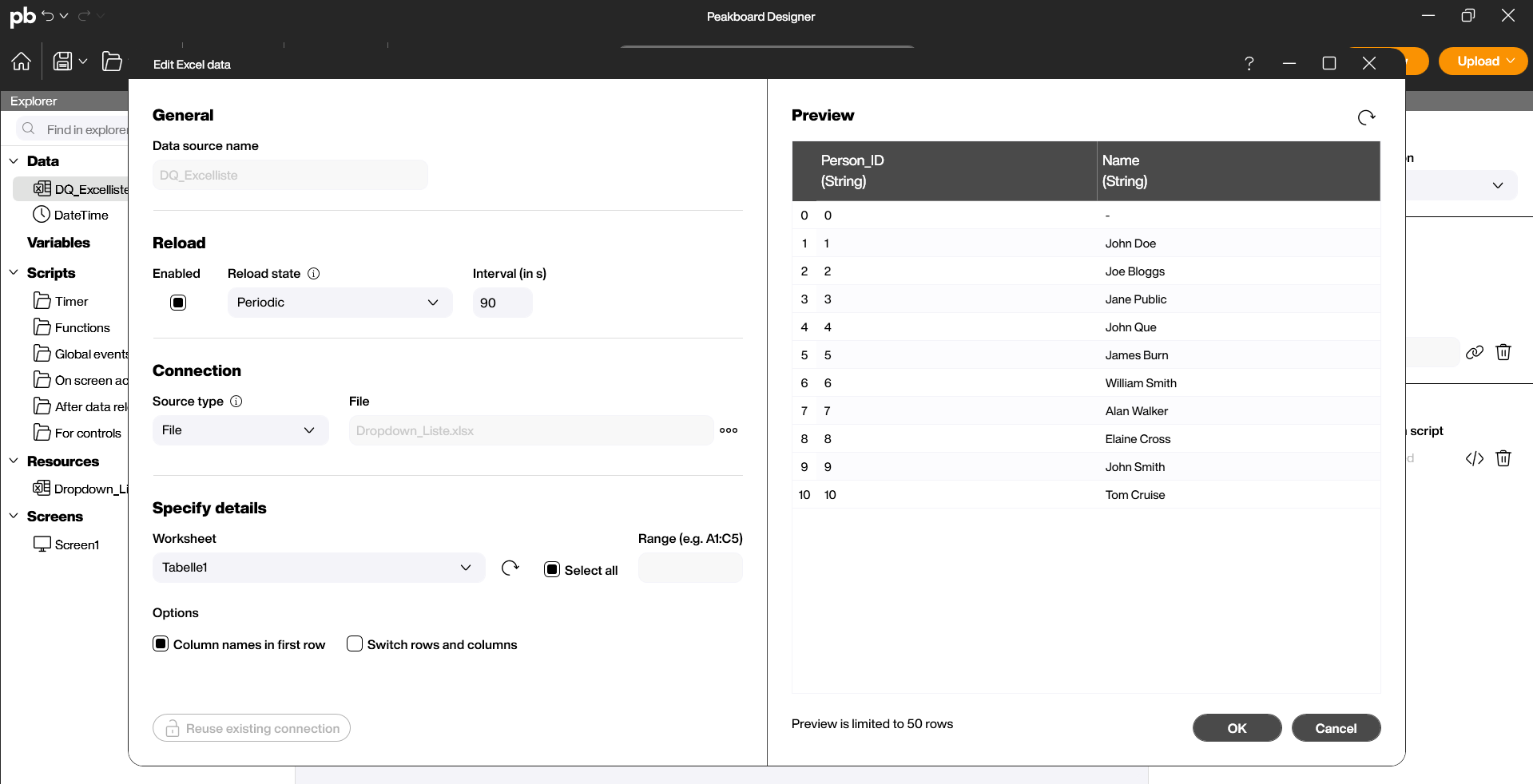
The table is almost always fed dynamically. Drag and drop the icon onto your workspace, or double-click the icon to link the data source you have already added to the Designer under “Data” with the control (1).

1.2 Column Manager
Under Data in the properties on the right side, you can determine which columns of your data source should be displayed (1). You can rename, hide, or change the order of columns. Edit table columns: Within the table, you can define the column header, column width, alignment, content format, and font to prepare information visually. You can change the order of the columns using drag-and-drop (2).

2 Properties and Conditional Formatting
In the attributes on the right side, you control the visual behavior:
- General: Define the dimensions of the table. Here you can also assign a title or a heading to it.
Appearance
- Background, Shadow & Corner Radius (Appearance): Style the background color of the table, set the shadow intensity the table casts on the design, and adjust the corners of the table (1).
- Outline (Appearance): Customize the visual representation of the lines in the table by activating the border, horizontal, and vertical lines, and determining the line color and thickness (2).
- Table Header (Appearance): Specify whether the column headers should be visible and set the background color and font of the header (3).
- Table Body (Appearance): Set the color and font for the rows or cells and determine the maximum number of displayed rows (4).
Logic
- Use in scripts (Logic): Give the control a unique name so that you can easily identify it later in scripting (5).
- Conditional Formatting (Logic): Create rules to color cells or entire rows based on values (e.g., background color “Red” if a value falls below a threshold) (6).

Scripting
The table allows you to react to user interactions, such as selecting a row.
Example: Read row data on click
Often, when a row is clicked, a detail value should be written to a variable or a log entry should be created. In this example, we will write the selected row number to the log by clicking on a row’s content. Steps in the Script Editor:
- Open the script editor under Logic -> Cell Clicked or Selection Changed.
- Use the “Write to log” block (1).
- Access the “Get row” block (2).
- Combine this with the “Write to log” block (3).
- Save the script by clicking “Save and Close” (4).

Start the preview and check the Log (1) to see if the return value is correctly displayed depending on the selected row of the table. Select different rows to expand the log.
